The first chart is the Case-Shiller Home Price index from 1890-2012, which shows a housing price index adjusted for inflation:
After moving between 60 and 140 for a century, the index spiked to 220 in late 2005, clearly indicating the existence of a housing bubble. As of late 2012, the index was down to 134.5 and appeared to be stabilizing (even increasing somewhat). Though this is still a little high by historical standards, it is in line with the performance since WW2.
The second chart is the ratio of consumer debt (credit market debt) to disposable income from the early 1950s to the present:
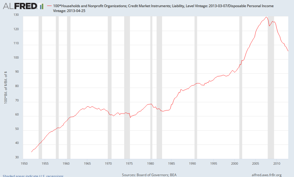
As can be seen, there was an upward trend over time, but the ratio jumped during the 2000s, rising from about 90% at the start of the century to 130% in the summer of 2007. Consumer deleveraging was essential to return to historical trends. As of the end of 2012, it was down to 105%. Though there's not a magic number that indicates deleveraging is complete, much progress has been made and it appears that it is now closer to the upward trend from the late 1980s to 2000. Of course the upward trend from the 1980s and 1990s was probably not sustainable (otherwise the ratio would continue to rise indefinitely). Whether the ratio should be 105% or 100% or..., it appears that most of the deleveraging has already taken place.
Though there are other indicators to consider, it appears that some of the excesses of the bubble era have been corrected, returning closer to historical norms.