The government released it's revised estimate of fourth quarter GDP yesterday and it contained something for everyone. The headline number was boring - the estimated growth of GDP remained at 3%. However, beneath the surface there was quite a bit of interesting information. There are different ways to measure the size of the economy including GDP and GDI, which should result in the same number. GDP (gross domestic product) estimates the size of the economy by combining total spending on goods and services produced in the US by consumers, business, government, and the rest of the world. As most people know, this is the number that gets the most attention. However, GDI (gross domestic income) is also a measure of the size of the economy and is estimated by adding the total income earned throughout the economy. Without getting into too much detail, the two numbers should be the same, differing only by measurement error (which is likely given a $15 trillion economy). The two numbers tend to track each other over time and differ only slightly. However, for short periods of time, they may paint somewhat different pictures of the strength of the economy. Some economists favor emphasizing GDO instead of GDP, making the case that it provides a more accurate picture of the economy (for example, click here).
While GDP indicated that the economy grew by 3% in the fourth quarter, GDI showed a stronger growth rate of 4.4%. Though GDI showed a weaker economy in the past, it points to relatively stronger growth in the second half of 2011. Some economists are thinking that may help explain the stronger than expected employment growth in recent months.
There was also information in the report for pessimists. When one strips out inventories (goods produced but not yet sold, etc.), instead of 3% growth, the economy grew by 1.1% in the fourth quarter. A build up in inventories also implies less need for production in future quarters. In addition, the growth in corporate profits declined. This isn't too much of a surprise since corporate profits had been soaring, but the growth of profits was still less than expected.
So how's the economy doing? Better, but still dealing with the effects of the crisis and facing headwinds from oil, Europe, and perhaps China.
Friday, March 30, 2012
Friday, March 23, 2012
State of the Economy: Economic Growth vs. Job Market
Depending on where you look, the economy is either continuing to grow at a modest pace or beginning to accelerate. Economic growth was about 1.6% over the last 12 months, which is likely to rise to about 2% when first quarter GDP is released next month. Meanwhile, employment growth has increased recently, rising just over 1.5% for the last year, but at an annualized rate of 2.3% so far in 2012. So GDP is plodding along while the job market appears to be strengthening. I decided to take a deeper look into this to see how it compares to past economic recoveries. Let's take a look at a couple of charts to examine this relationship. The first chart simply presents economic growth and employment growth over the previous 12 months (blue line is economic growth, red line is employment):
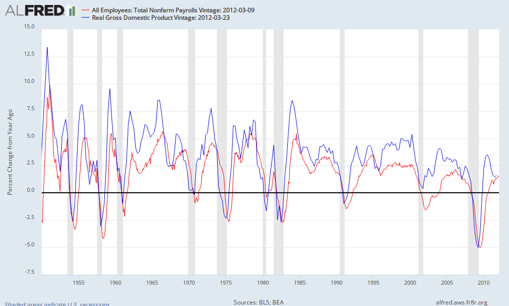
As you can see, the blue line is normally above the red line (economic growth typically exceeds employment growth). With few exceptions, employment growth only exceeds economic growth near the beginning of recessions. Let's look at it from another perspective. Another measure of the job market is the aggregate hours worked. Many economists see this as a more precise gauge of the job market since it not only accounts for the number of jobs, but also how many hours people are working on the job. By taking the ratio of GDP to hours worked, one gets an estimate of productivity (output per hour). The following chart shows the behavior of GDP per hour over time.
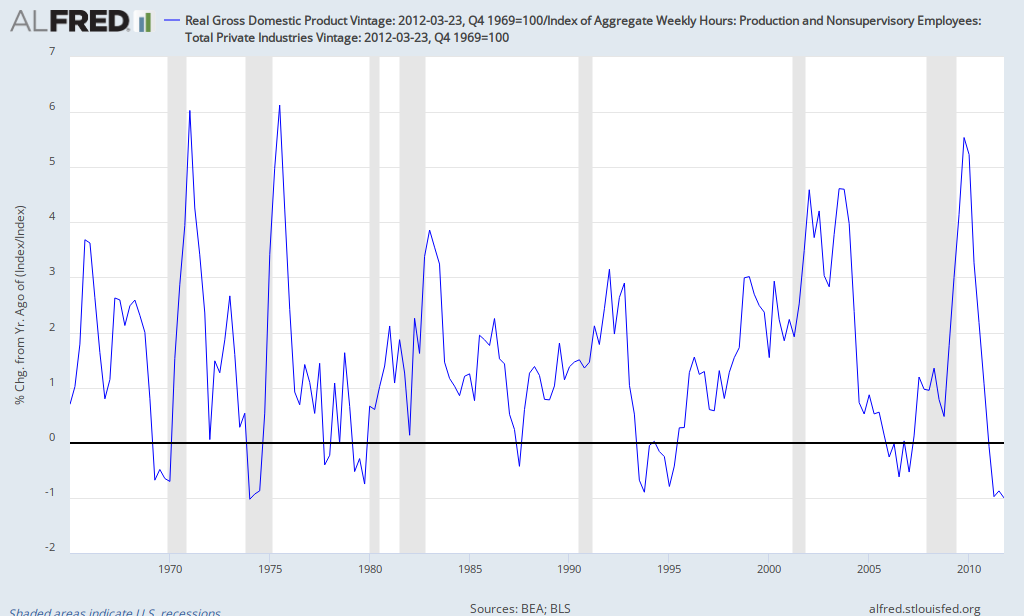
From this chart, it is evident that the current recovery is similar to but also different from past recoveries. When the economy comes out of a recession, GDP per hour typically grows quickly as evidenced by the recoveries of 1970, 1975, 1983, and the current recovery. As the expansion takes hold, the surge typically subsides. The average difference betweem economic growth and employment growth over the period was 1.5% (so when economic growth is 2.5%, employment growth tends to be about 1%). What's different this time is that it didn't just moderate as in the past, but is actually shrinking by 1%, which is lower than virtually any other period since data for hours worked became available (only comparable decline was during the severe recession of 1974, when it also declined by 1%). The only other time in which it shrank without leading to or being in a recession was in 1994.
I'm not predicting a recession, but pointing out that it would be unprecedented for the job market to continue to improve unless economic growth strengthened significantly. Given consensus forecasts of modest economic growth (about 2.5% for 2012), the recent strengthening of the labor market is unlikely to be sustained (current pace would result in about 3 million jobs this year). If employment grew by about 1.5% in 2012, that would still mean a gain of about 2 million jobs. Of course many factors will determine the outcome including the European recession, the slowdown in China, rising gas prices, etc. The key point is that the performance of the job market must eventually reflect what's happening to economic growth.
As you can see, the blue line is normally above the red line (economic growth typically exceeds employment growth). With few exceptions, employment growth only exceeds economic growth near the beginning of recessions. Let's look at it from another perspective. Another measure of the job market is the aggregate hours worked. Many economists see this as a more precise gauge of the job market since it not only accounts for the number of jobs, but also how many hours people are working on the job. By taking the ratio of GDP to hours worked, one gets an estimate of productivity (output per hour). The following chart shows the behavior of GDP per hour over time.
From this chart, it is evident that the current recovery is similar to but also different from past recoveries. When the economy comes out of a recession, GDP per hour typically grows quickly as evidenced by the recoveries of 1970, 1975, 1983, and the current recovery. As the expansion takes hold, the surge typically subsides. The average difference betweem economic growth and employment growth over the period was 1.5% (so when economic growth is 2.5%, employment growth tends to be about 1%). What's different this time is that it didn't just moderate as in the past, but is actually shrinking by 1%, which is lower than virtually any other period since data for hours worked became available (only comparable decline was during the severe recession of 1974, when it also declined by 1%). The only other time in which it shrank without leading to or being in a recession was in 1994.
I'm not predicting a recession, but pointing out that it would be unprecedented for the job market to continue to improve unless economic growth strengthened significantly. Given consensus forecasts of modest economic growth (about 2.5% for 2012), the recent strengthening of the labor market is unlikely to be sustained (current pace would result in about 3 million jobs this year). If employment grew by about 1.5% in 2012, that would still mean a gain of about 2 million jobs. Of course many factors will determine the outcome including the European recession, the slowdown in China, rising gas prices, etc. The key point is that the performance of the job market must eventually reflect what's happening to economic growth.
Thursday, March 15, 2012
Oil Prices and the Value of the Dollar
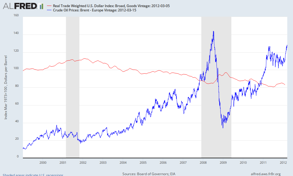
A student recently asked about the role of the dollar in explaining oil and gas prices. When you listen to some commentators, they blame the declining dollar as the major reason for higher oil prices (a view rejected by most economists). My approach is to look at the facts and then draw conclusions. so let's take a look at the behavior of the dollar and oil prices in recent years. Since the source of my data includes the trade-weighted exchange rate only since 1999 (which happens to be close to the bottom in oil prices), I chose that as my starting point (note: the trade-weighted exchange rate reflects the average value of the dollar based on a country's trading partners; some average is necessary since the dollar has different exchange rates with different currencies). When it comes to oil, I chose Brent North Sea Crude since most experts think that's the most relevant measure in recent years. However, I'm also including a chart for West Texas Intermediate Crude (the other popular measure of oil prices).
First, here's what happened to the dollar and oil prices since 1999 (blue line is oil, red is the value of the dollar):
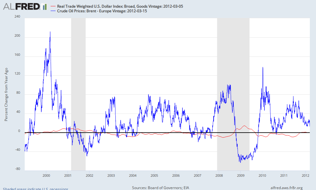
Now here's the percent change in the value of the dollar and oil prices (percent change from one year earlier):
Does it make any difference if one uses West Texas Intermediate instead of Brent (green is oil)?
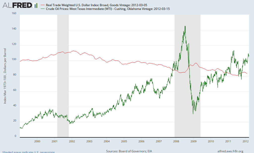
If you look carefully, you can see a relationship at times, but clearly fluctuations in the oil far exceed that of the dollar. Before we discuss it further, it should be noted that most oil is traded globally in terms of dollars, so a decline in the value of the dollar doesn't directly affect the price of imported oil. However, if the dollar declines in value, since oil is priced in dollars, it becomes cheaper for other countries to purchase, thus increasing the demand for oil elsewhere, putting upward pressure on its price. Speculators may speed up this process as they anticipate these changes.
In addition, some events can cause both the dollar to increase in value and the price of oil to decrease. For example, the financial crisis of 2008 caused global investors to shun risky assets (such as oil), leading to lower oil prices. Investors put their funds in the perceived safest haven, US bonds, causing a significant increase in the demand for dollars, thus increasing its value. Thus, the major event wasn't a stronger dollar reducing the price of oil, but risk-aversion causing a stronger dollar and lower oil prices. As investors became willing to accept more risk, this process was reversed - the dollar weakened and oil prices rose (both caused primarily by investors becoming less risk averse).
So is the weak dollar to blame for high oil prices? Though there is some impact, the data indicates that it plays a minor role at most.
First, here's what happened to the dollar and oil prices since 1999 (blue line is oil, red is the value of the dollar):
Now here's the percent change in the value of the dollar and oil prices (percent change from one year earlier):
Does it make any difference if one uses West Texas Intermediate instead of Brent (green is oil)?
If you look carefully, you can see a relationship at times, but clearly fluctuations in the oil far exceed that of the dollar. Before we discuss it further, it should be noted that most oil is traded globally in terms of dollars, so a decline in the value of the dollar doesn't directly affect the price of imported oil. However, if the dollar declines in value, since oil is priced in dollars, it becomes cheaper for other countries to purchase, thus increasing the demand for oil elsewhere, putting upward pressure on its price. Speculators may speed up this process as they anticipate these changes.
In addition, some events can cause both the dollar to increase in value and the price of oil to decrease. For example, the financial crisis of 2008 caused global investors to shun risky assets (such as oil), leading to lower oil prices. Investors put their funds in the perceived safest haven, US bonds, causing a significant increase in the demand for dollars, thus increasing its value. Thus, the major event wasn't a stronger dollar reducing the price of oil, but risk-aversion causing a stronger dollar and lower oil prices. As investors became willing to accept more risk, this process was reversed - the dollar weakened and oil prices rose (both caused primarily by investors becoming less risk averse).
So is the weak dollar to blame for high oil prices? Though there is some impact, the data indicates that it plays a minor role at most.
Tuesday, March 13, 2012
Employment Report for Florida and Metro Orlando
This morning, the government released the January employment report for states and major metropolitan areas. There was good news and bad news for Florida and Orlando. The unemployment rate for Florida declined to 9.6% while Orlando's unemployment rate stood at 9.5%, both representing multi-year lows. One surprise was that Florida had the worst performance of any state in terms of job creation, showing a loss of 38,600 jobs in January, considerably more than any other state in a month when the nation added 284,000 jobs. What happened? One interesting quirk is evident when one compares the seasonally adjusted data to that which is not seasonally adjusted. Recall that seasonal adjustments are used to account for factors that occur the same time every year. For example, stores hire workers in November and December for the Christmas season and lay them off in January. Accounting for this allows one to better understand the performance of the economy from month to month, though it shouldn't make a difference when comparing the performance to the same month of the previous year. However, the government revises the seasonal adjustments occasionally, which occasionally leads to some "quirks" in the data (for example, see previous post).
Am I getting too bogged down into the details? Florida added 74,900 jobs over the last 12 months (January 2011 to January 2012). Once the data is seasonally adjusted, it only added 54,200 jobs; a difference of over 20,000 jobs. Given that January 2011 was in the same season as January 2012, one wonders what happened to those 20,000 jobs? That accounts for a majority of the job losses reported for Florida in January. Either way, the Florida job market struggled in January. Particular areas of weakness compared to the nation included temp jobs, private education, wholesale & retail trade, construction, and government (in other words, it was not limited to one sector).
Employment growth in both Florida and Orlando has lagged the nation over the last 12 months, due in part to the extreme weakness in January. While employment grew by 1.5% nationally, it grew by 0.7% in Florida and 0.8% in Orlando. Orlando had been the fastest growing major metropolitan area in Florida during much of the early part of the recovery; however, Miami and Tampa (and others) are now experiencing faster job growth.
Friday, March 9, 2012
A good jobs report
There's alot to like about this morning's job report. Though warmer than usual weather and seasonal adjustments may have played some role, there's clearly an underlying strengthening in the job market. The economy has now added more than half a million private-sector jobs in the first 2 months of 2012. While there's been criticism that a major reason for recent declines in the unemployment rate were due to people leaving the labor force, the participation rate actually increased from 63.7% to 63.9% in February as an additional 400,000+ adult women entered the labor force. Other positive results include the lowest u6 measure of unemployment since January 2009 (14.9%); most of the jobs added were full time; those working part-time for economic reasons declined by 100,000, ... Which industries added the most jobs? Health care added almost 50,000 jobs; temp agencies added about 45,000; and employment in food services and drinking places rose by 40,000. Though jobs in the latter two categories tend to be lower paying, the increase in temp jobs tends to be a positive sign for future job growth.
Does this mean that the economy is accelerating and strong growth is here to stay? Looking back at 2011, the economy added almost 240,000 jobs a month from February to April, but then added just over 110,000 jobs per month from May to November. Though employment grew by about 1.4% in 2011, GDP grew by 1.7%, indicating that growth in productivity was quite low. In order to sustain job growth at this rate, economic growth needs to be closer to 3%. Given consensus forecasts of about 2.5% growth along with a minor global slowdown (slower growth in China and Brazil along with a European recession) and high gas prices, the most likely scenario is modest economic growth with some downside risk, which implies a slowdown in employment growth as we go further into 2012. The US economy will continue to make progress, barring a shock, but not robust growth by any historical standard.
By the way, where do we stand compared to before the recession? The economy still has 5.285 million fewer jobs than at the end of 2007, a decline of 3.8%. On a more positive note, the US economy has added 3.45 million jobs since the low set in February 2010.
Thursday, March 8, 2012
GDP: Small Business vs. Large Business
A story about how the small business share of GDP declined below 45% in 2010 caught my attention, so I decided to explore it further. Here's a link to the report behind the headlines. First, it should be noted that the report defines a small business as a company with fewer than 500 employees (so large businesses are those with 500 or more employees). There's quite a bit of interesting information available. For example, here's a chart showing nominal economic growth for small businesses vs. large businesses since 2003 (the classification system changed in 2003, so it represents a good starting point):

Why the underperformance of smal businesses? One reason is construction, which represents about 10% of small business GDP, but only 2% of large business GDP. In addition, in several sectors, large businesses outperformed small businesses. For example, manufacturing suffered a significant decline in 2009 regardless of the size of the firm, but large business manufacturing declined by 6.4% while small business manufacturing declined by 15.5%. As manufacturing rebounded in 2010, large businesses grew by 6.9% while small businesses grew by 4%. Similarly, in wholesale and retail trade, small businesses declined at nearly three times the rate of large businesses in 2008-2009.
Which sectors are dominated by small businesses in terms of share of GDP? Construction (83%), Real Estate & Leasing (75%), and Arts & Entertainment (69%). Large Businesses dominate Utilities (nearly 90%), Information Services (88%), and Manufacturing (72%). Just over 13% of small business GDP comes from Wholesale & Retail Trade while just over 12% comes from Real Estate/Leasing and Professional/Technical Services, respectively. As of 2010, the largest shares of large business GDP are derived from Manufacturing (21%), Finance (15.6%), and Wholesale/Retail Trade (14%).

For the period as a whole, the nominal growth of large business GDP grew by 46% while small business GDP grew by 26%. You'll note the rapid growth of large business GDP in 2010; nearly 60% of the growth was due to one sector - finance (this was not a rebound from the crash but represented nearly a 30% increase from the previous peak).
Why the underperformance of smal businesses? One reason is construction, which represents about 10% of small business GDP, but only 2% of large business GDP. In addition, in several sectors, large businesses outperformed small businesses. For example, manufacturing suffered a significant decline in 2009 regardless of the size of the firm, but large business manufacturing declined by 6.4% while small business manufacturing declined by 15.5%. As manufacturing rebounded in 2010, large businesses grew by 6.9% while small businesses grew by 4%. Similarly, in wholesale and retail trade, small businesses declined at nearly three times the rate of large businesses in 2008-2009.
Which sectors are dominated by small businesses in terms of share of GDP? Construction (83%), Real Estate & Leasing (75%), and Arts & Entertainment (69%). Large Businesses dominate Utilities (nearly 90%), Information Services (88%), and Manufacturing (72%). Just over 13% of small business GDP comes from Wholesale & Retail Trade while just over 12% comes from Real Estate/Leasing and Professional/Technical Services, respectively. As of 2010, the largest shares of large business GDP are derived from Manufacturing (21%), Finance (15.6%), and Wholesale/Retail Trade (14%).
There's much more information available in the report. It confirms what most people already knew; small businesses are struggling as the economy continues to recover from the Great Recession.
Thursday, March 1, 2012
Interesting Chart: Private vs. Public Economic Growth, 2008-2011
Some interesting charts from the Treasury Notes column of the US Treasury. The one that caught my eye was the following: As can be seen, the decline in the prviate economy, as represented by nonfarm business, was even more severe than GDP in late 2008/early 2009 (2008Q4: 8.9% decline in GDP vs. 12.7% decline in nonfarm business; 2009Q1: 6.7% decline in GDP vs. 8.7% decline in nonfarm business). This was offset somewhat by government's positive contribution to GDP (at least in the short run). However, the government has been a drag on the economy since the summer of 2010; state and local governments have subtracted from GDP since Spring 2009.
 As can be seen, the decline in the prviate economy, as represented by nonfarm business, was even more severe than GDP in late 2008/early 2009 (2008Q4: 8.9% decline in GDP vs. 12.7% decline in nonfarm business; 2009Q1: 6.7% decline in GDP vs. 8.7% decline in nonfarm business). This was offset somewhat by government's positive contribution to GDP (at least in the short run). However, the government has been a drag on the economy since the summer of 2010; state and local governments have subtracted from GDP since Spring 2009.
Latest reports on GDP, Income, and Spending
The BEA released revised figures for fourth quarter economic growth, indicating that the economy grew at a 3% annualized rate, a little faster than first thought. There were minor changes: a slightly smaller increase in inventories and a slightly larger increase in spending, but it still means that most of the growth was due to a build up in inventories, with final sales increasing at just over a 1% rate. On a more positive note, GDI (gross domestic income) was revised up, resulting in a higher savings rate, suggesting that consumers may be in slightly better shape than previously estimated.
This morning, information on income and spending was released, showing a slight decline in disposable income adjusted for inflation and no growth in inflation-adjusted consumption. That means consumption has been flat for 3 straight months. Given that disposable income is just barely keeping pace with inflation, consumption has been and is expected to continue to remain constrained. Meanwhile, inflation as measured by the PCE index declined to 2.4% over the last year, after approaching 3% last summer. Excluding food and energy, inflation was about 2% over the last 12 months.
Add it up and it continues to tell the same story: a sluggish recovery as consumer spending is held back by sluggish growth in income and continued deleveraging.
Subscribe to:
Posts (Atom)