Today's report on income and spending for September continued the recent trend of stagnant income accompanied by increased spending (3 straight months). Disposable income adjusted for inflation was flat in September (very small decline), which follows a decline in August and a small increase in July. During the last 3 months, real disposable income declined at an annualized rate of 0.8% (though it's risen by 1.9% over the last 12 months). Meanwhile, personal consumption rose by 2% for the quarter. Given the declining income and rising consumption, the savings rate fell to 3.3%, down from 4.4% in June 2012 (the lowest since November 2011). If it drops a little more, it will be the lowest since late 2007. On positive note, both overall and core inflation are running at a 1.7% rate over the last year (though inflation spiked somewhat in September due to increased energy prices, which will be reversed in the October report).
The takeaway from this report is similar to previous reports. How long can consumer spending increase when it's not supported by increases in disposable income? That brings up the issue of the fiscal cliff. As of now, the consensus is that the payroll tax cut will be allowed to lapse, resulting in a 2% tax increase on earnings, thus reducing disposable income as we enter 2013. Combine this with a low savings rate and things don't look good for consumer spending in the first quarter of 2013.
Monday, October 29, 2012
Friday, October 26, 2012
Third Quarter GDP Report
The government released its initial estimate of GDP for the third quarter and it came in slightly higher than expected at a 2% annualized growth rate (compared to 1.3% in the second quarter and 2% in the first quarter). Consumer spending rose by 2%, federal government spending (led by defense) rose by 9.6%, and residential investment rose by 14.4%. On the downside, business investment declined by 1.3% and exports fell by 1.6%. The primary contributors to the faster growth were government spending (went from subtracting 0.1% from growth in the second quarter to adding 0.7% in the third quarter) and consumer spending which added 1.4% to growth in the third quarter compared to 1.1% in the second quarter.
What does the report suggest about the strength of the private sector? Here's a chart of final private demand over the last 5 years (includes consumption, fixed investment (not inventories), and net exports):

A major reason for this slowdown is the weakness of business investment in equipment and software:
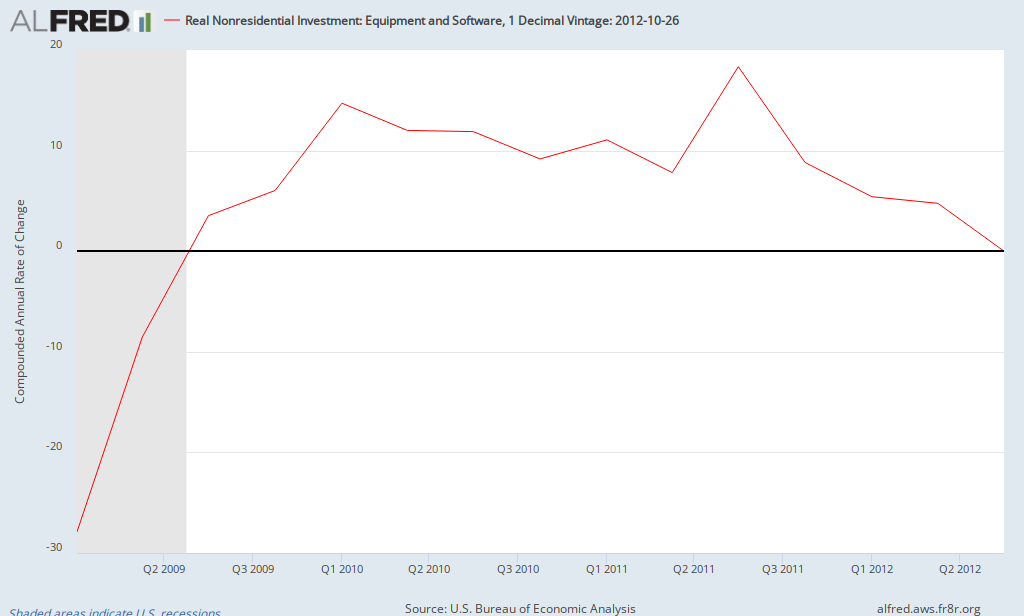
After growing at about a 10% rate in 2010 and 2011 and 5% in the first half of 2012, investment in equipment and software was flat (tiny negative) in the third quarter, the weakest performance since the Spring of 2009 (at the end of the recession). In addition, exports declined for the first time since the first quarter of 2009, reflecting the global economic slowdown.
What's the takeaway? The economy continues to struggle, still growing but at a low rate with some signs of increasing weakness in the private sector.
What does the report suggest about the strength of the private sector? Here's a chart of final private demand over the last 5 years (includes consumption, fixed investment (not inventories), and net exports):

After posting a gain of 3% in the first quarter of 2012, the growth rate of private demand has declined to 1.9% in the second quarter and 1.4% in the third quarter (the lowest growth since the summer of 2010). Thus, while the the headline number showed slightly faster growth, the underlying strength of the private sector seems to be slipping.A major reason for this slowdown is the weakness of business investment in equipment and software:

After growing at about a 10% rate in 2010 and 2011 and 5% in the first half of 2012, investment in equipment and software was flat (tiny negative) in the third quarter, the weakest performance since the Spring of 2009 (at the end of the recession). In addition, exports declined for the first time since the first quarter of 2009, reflecting the global economic slowdown.
What's the takeaway? The economy continues to struggle, still growing but at a low rate with some signs of increasing weakness in the private sector.
Friday, October 19, 2012
Declining Risk Premium: QE3?
The risk premium on Baa corporate bonds has declined significantly in recent weeks and now stands at 2.72% (as of Thursday Oct 18), the lowest since the summer of 2011. Here's a chart of its recent behavior (chart is weekly data since Aug 24 (the week before Bernanke's speech at Jackson Hole; doesn't include the decline to 2.72% so far this week):
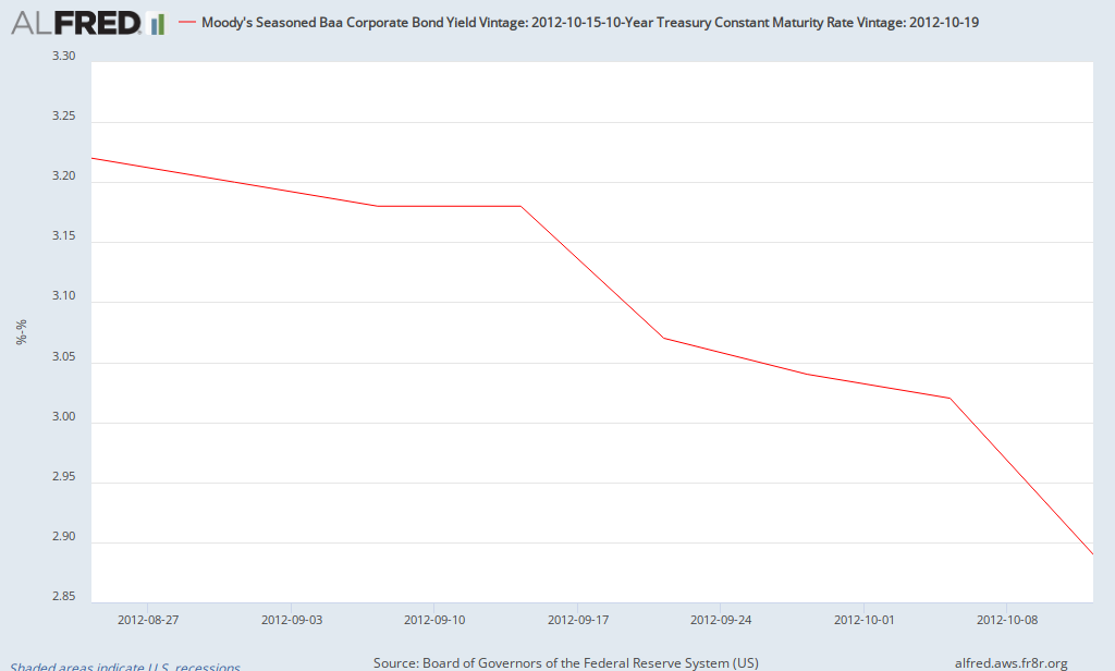
When was the last time it declined this much?
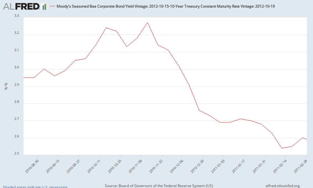
What was taking place during this period (Fall 2010 to early 2011)? QE2. Thus, there's evidence that QE2 helped the Baa risk premium to fall by about 0.75%. So far, QE3 has resulted in a decline in the risk premium of 0.5%. How long did the decline from QE2 last? It remained between 2.5% and 2.6% for most of the next 3 months before beginning to rise again in June 2011 (as QE2 came to an end).
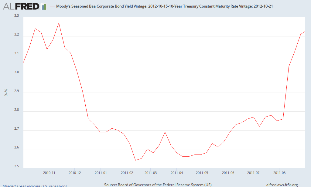
Update: Here's the rest of the story - a chart that shows the risk premium from the start of QE2 until the debt limit controversy of August 2011 (note: the risk premium was about 2.8% at the end of July 2011 before spiking in August 2011).
The Fed must be happy to see evidence of easing of credit so far due in part to QE3. Given the open endedness of QE3, will the risk premium continue to decline and remain relatively low (at least compared to recent times)? We'll have to wait and see.
When was the last time it declined this much?
What was taking place during this period (Fall 2010 to early 2011)? QE2. Thus, there's evidence that QE2 helped the Baa risk premium to fall by about 0.75%. So far, QE3 has resulted in a decline in the risk premium of 0.5%. How long did the decline from QE2 last? It remained between 2.5% and 2.6% for most of the next 3 months before beginning to rise again in June 2011 (as QE2 came to an end).
Update: Here's the rest of the story - a chart that shows the risk premium from the start of QE2 until the debt limit controversy of August 2011 (note: the risk premium was about 2.8% at the end of July 2011 before spiking in August 2011).
The Fed must be happy to see evidence of easing of credit so far due in part to QE3. Given the open endedness of QE3, will the risk premium continue to decline and remain relatively low (at least compared to recent times)? We'll have to wait and see.
September Employment Report: Florida & Orlando
This morning, the government released the latest employments report for states and local areas (link to Florida report). The unemployment rate for Florida dipped slightly to 8.7%. As with the national numbers, the household survey (used to estimate the unemployment rate) was more positive than the establishment survey (used to estimate the change in payrolls). For the month, Florida added 800 jobs (though it should be noted that it added 23,900 jobs in August). The sectors posting the largest gains were Arts, Entertainment & Recreation (up 5000 jobs or 2.7%) and construction, which added 4200 jobs (+1.3%). This was offset by losses in administrative and waste services, which shed 9400 jobs (state data is seasonally adjusted).
For the second straight month, metro Orlando had a standout sector. Last month, professional and business services added 6100 jobs. This month, construction added 3500 jobs (up more than 10%), its largest monthly gain since at least 1990 (that's how far back the BLS data goes for metropolitan areas). Florida as a whole added 3000 construction jobs in September (not seasonally adjusted), so that entire gain and more was due to Orlando. Given these recent gains, Orlando now leads the state in employment growth over the last 12 months. The unemployment rate in Orlando declined to 8.4% (not seasonally adjusted). When the seasonally adjusted data comes out later this month, it will probably be 8.2 to 8.3%, the lowest since December 2008 (down from a peak of 11.5% in January 2010). It appears that the Orlando economy may be coming back to life. Time will tell if these gains continue.
For the second straight month, metro Orlando had a standout sector. Last month, professional and business services added 6100 jobs. This month, construction added 3500 jobs (up more than 10%), its largest monthly gain since at least 1990 (that's how far back the BLS data goes for metropolitan areas). Florida as a whole added 3000 construction jobs in September (not seasonally adjusted), so that entire gain and more was due to Orlando. Given these recent gains, Orlando now leads the state in employment growth over the last 12 months. The unemployment rate in Orlando declined to 8.4% (not seasonally adjusted). When the seasonally adjusted data comes out later this month, it will probably be 8.2 to 8.3%, the lowest since December 2008 (down from a peak of 11.5% in January 2010). It appears that the Orlando economy may be coming back to life. Time will tell if these gains continue.
Friday, October 5, 2012
September Job Report
The government released the September job report this morning and there were some surprises. The headline numbers show that the unemployment rate fell to 7.8% (lowest since January 2009) while 114,000 jobs were added. How did the unemployment rate fall from 8.1% to 7.8%? Unlike the last year or two, the labor force participation rate actually rose slightly to 63.6%. So what happened? The household survery showed an increase of over 800,000 jobs in September. However 582,000 of those jobs are due to more people working part-time for economic reasons (which rose from 8 million to 8.6 million people). That's why that, even though the unemployment declined, the broader measure of unemployment (U6) was unchanged at 14.7%. On a related note, some have suggested that the household survey may be capturing an increase in self-employed workers which are not fully captured by the establishment survey. However, using nonseasonally-adjusted numbers, self-employed workers declined by 19,000 (including both incorporated and unincorporated) while total jobs added was 775,000 (based on the household survey). Thus, a surge in self-employed workers doesn't seem to explain the surge in employment based on the household survey.
Moving over to the establishment survey, the private sector added 104,000 jobs while the government added 10,000. Leading industries include ambulatory and health services (+29,800), food and accomodation service (+15,700), and state government education (+13,600). It should be noted that revisions show about 40,000 more jobs created than previously reported in both July and August.
Given the different pictures of the job market presented by the two surveys, let's take a look at charts of employment growth according to each. The following is a chart of the number of jobs created according to the household survey each month over the last decade. It should be noted than some of the January numbers are misleading due to adjustments in population control.
 An here's the monthly employment gains in private sector payrolls (establishment survey).

As is evident, the establishment survey is much more stable. Most economists consider the establishment survey to be a more reliable measure of the job market. So what's my takeaway from this morning's report? A continuation of modest employment growth (private employment rose by 104,000 in September and 97,000 in August). The household survey tends to be volatile and seems to be misleading this month. After accounting for population controls, it showed the most rapid growth in employment since 1983. One other piece of trivia. this was the third larvest positive gap between the household and establishment survey (after adjusting for population controls) in the last 50 years. Did the economy creat anywhere near 873,000 jobs resulting in a significant decline in the unemployment rate? Not likely. The payroll number is much more align with most economic data which indicate a sluggish economy which is still experiencing a a slow recovery.
Moving over to the establishment survey, the private sector added 104,000 jobs while the government added 10,000. Leading industries include ambulatory and health services (+29,800), food and accomodation service (+15,700), and state government education (+13,600). It should be noted that revisions show about 40,000 more jobs created than previously reported in both July and August.
Given the different pictures of the job market presented by the two surveys, let's take a look at charts of employment growth according to each. The following is a chart of the number of jobs created according to the household survey each month over the last decade. It should be noted than some of the January numbers are misleading due to adjustments in population control.


As is evident, the establishment survey is much more stable. Most economists consider the establishment survey to be a more reliable measure of the job market. So what's my takeaway from this morning's report? A continuation of modest employment growth (private employment rose by 104,000 in September and 97,000 in August). The household survey tends to be volatile and seems to be misleading this month. After accounting for population controls, it showed the most rapid growth in employment since 1983. One other piece of trivia. this was the third larvest positive gap between the household and establishment survey (after adjusting for population controls) in the last 50 years. Did the economy creat anywhere near 873,000 jobs resulting in a significant decline in the unemployment rate? Not likely. The payroll number is much more align with most economic data which indicate a sluggish economy which is still experiencing a a slow recovery.
Subscribe to:
Posts (Atom)