Friday, December 21, 2012

Fiscal Cliff: Looking at some numbers

As we get closer to the fiscal cliff, I thought it would be helpful to consider different ways that the government can reduce future deficits and debt.  Here are some numbers that I shared with my classes a few weeks ago.  As noted, this is not my proposal (though I support some of the items).  Instead, it provides some context for what needs to be done to contain the national debt.  All numbers reflect 10-year esimates by the Congressional Budget Office.
 
 
Program 10-year savings
change the cost-of-living adjustment for government pensions (including military) $24 billion
change the cost-of-living adjustment for Social Security $112 billion
raise age for Medicare eligibility to coincide with Social Security $125 billion
raise the early retirement age for Social Security (full retirement is being raised by 2 years, this would raise early retirement also by 2 years; phased in over time) $144 billion
reduce the growth rate of non-defense discretionary spending by 1% annually $327 billion
reduce the growth rate of defense spending by 1% annually $286 billion
cap tax deductions at $50,000 $749 billion
raise top tax rate by 1% $84 billion
change the inflation rate used for indexing various parts of the tax code $72 billion
raise gas tax by 10 cents per gallon $175 billion
total (not including savings on interest) $2.1 trillion

Personal Income and Spending for November

The government released its estimate of personal income and spending for November and it contained some pretty good news (good is relative nowadays!).  Real disposable income rose by 0.8% while real consumer spending rose by 0.6% (reflecting an inflation rate of -0.2% for the month due to declining energy prices).  The report confirms that Hurricane Sandy contributed to the weakness in October, so the November figures reflect a bounceback from a temporarily depressed level.  If one takes a 3-month average, real disposable income is growing at an annualized rate slightly in excess of 3% (mainly driven by November's surge) while real consumer spending is growing in excess of 3.5% (annualized).  The personal savings rate rose to 3.6% (from 3.4%).  On the inflation, both core and overall inflation are approximately 1.5% (overall inflation is 1.4% over the past year; core inflation is 1.5%).

The surprise from the report was the surge in real disposable income.  Though some of it reflects a bounceback from Sandy, real disposable income has increased by 2.5% in the last 12 months, the highest year-over-year change since March 2011.  If this is sustained, consumers may be better able to handle tax hikes than previously thought.  It gets a little complex, but it's doubtful whether this pace will be sustained since it reflects depressed income in November 2011 and a surge in November 2012.  Of course the big issue is how the resolution to the fiscal cliff will affect disposable personal income.  Given the likelihood of the end of the payroll tax cut and higher taxes on upper-income individuals, real disposable income will take a significant hit in early 2013.  The size of the impact on consumer spending will determine how weak the economy will be in the first half of next year.

Wednesday, December 12, 2012

Fed announcement: 12-12-12

The Fed broke more new ground today in it's policy announcement.  As expected, with the end of Operation Twist (selling short-term securities and buying long-term securities), it now plans to purchase long-term Treasuries ($45 billion per month) in addition to $40 billion worth of mortgage-backed securities each month.  If you do the math, that's about $1 trillion per year (for comparison purposes, net purchases were $2 trillion over the past 4 years).  How long will continue with such a loose monetary policy?  Rather than saying until things get better, the Fed got specific.  To quote:

"the Committee decided to keep the target range for the federal funds rate at 0 to 1/4 percent and currently anticipates that this exceptionally low range for the federal funds rate will be appropriate at least as long as the unemployment rate remains above 6-1/2 percent, inflation between one and two years ahead is projected to be no more than a half percentage point above the Committee’s 2 percent longer-run goal, and longer-term inflation expectations continue to be well anchored."


Ben Bernanke will discuss this at his news conference this afternoon, but here's what they're thinking.  Inflation is low and is expected to remain low for quite a while.  The Fed is comfortable as long as inflation stays close to its medium-term target of 2%.  Specifically, high inflation is now defined as a medium-term forecast exceeding 2.5% (medium term means 1 to 2 years from now).  In addition, inflation expectations need to be contained (not sure what their gauge will be, but possibly based on the TIPS market).  Assuming that inflation is under control, the Fed will keep the federal funds rate between 0-0.25% as long as the unemployment rate is above 6.5%.  Why 6.5%?  The Fed considers NAIRU to be between 5.2% and 6%.  What does that mean?  The Fed thinks unemployment would have to fall below NAIRU for there to be upward pressure on inflation; 6.5% gives it a cushion given that monetary policy takes some time to have an effect (and takes some time to reverse those effects). 

Key points:
  • So rather than stating that interest rates will remain low until the economy improves or as long as inflation is contained, the Fed has now stated what that means.  Recall that the Fed has a dual mandate - low inflation and low unemployment.  It now has stated specifically how achieving both parts of that mandate will guide their policy in the coming years.
  • It should be noted that the Fed statement says the federal funds rate will remain low as long as unemployment is above 6.5% and expected inflation is less than 2.5%.  That doesn't necessarily mean that it will engage in quantitative easing (bond purchases) for that same period.
  • When is unemployment is expected to decline to below 6.5%.  Based on the December Fed forecast, this will take place in 2015, while most private forecasters think that won't occur until late 2015 or 2016 (see my economic forecast page).

Monday, December 10, 2012

Black Friday as an Indicator of Holiday Spending

One of my most viewed posts in the last 12 months considered whether Black Friday sales provided a good indicator of holiday sales and consumer spending, so I decided to update it for 2012 (here's a link to update for the 2011 holiday season once all the data had become available).  Let's update the table given the performance of Black Friday in 2012 (numbers in parentheses reflect sales after adjusting for inflation):

 
Year
Black Friday*
Holiday Sales
Consumption Q4
2012
+2.7% (+1.0%)
?
?
2011
+6.6% (+4.0%)
+4.1% (+1.5%)
+2.0%
2010
+0.3% (-1.0%)
+5.2% (+3.9%)
+3.6%
2009
+0.5% (-1.0%)
-0.4% (-1.9%)
+0.4%
2008
+3% (+1.3%)
-2.8% (-4.5%)
-5.1%
2007
+8% (+4.5%)
+2.4% (-1.1%)
+1.2%
2006
+6% (+4.1%)
+4.6% (+2.7%)
+3.8%
*Black Friday weekend (Thurs-Sun) was used for 2012
note: data for Black Friday sales comes from ShopperTrak; Holiday Sales comes from the National Retail Federation; Consumption comes from the BEA (Commerce Dept)

You'll note one change in the table.  Given the increased relevance of Thanksgiving Day sales, Black Friday weekend was used for 2012 (sales for Black Friday declined in 2012 as many people shopped on Thanksgiving night instead of Black Friday).  Is the relatively small increase in sales this year a bad sign for the holiday shopping season?  As the table indicates, Black Friday sales tend to be a poor indicator of holiday sales and consumer spending, so there's hope.  On the flip side, in five of the previous six years, Black Friday sales rose more than holiday sales (exception was 2010), so the weakness may be a precursor for weak sales this year.

Why the weakness so far in 2012?  One reason is the growth in personal income.  Over the past 12 months (Oct 2011-Oct 2012), total real personal income (i.e., income adjusted for inflation) rose by 1.4% (note: this is total personal income, not the average per household).  How does that compare to previous years?  It rose by 1.9% for the comparable period in 2011 and 4.1% in 2010.  Thus, real personal income has outperformed Black Friday sales as a predictor of holiday spending.  A 4.1% increase in income led to a 3.9% increase in holiday spending in 2010 while a 1.9% increase in income led to a 1.5% in holiday spending in 2011.  What does that imply for 2012?  Based on recent patterns, a 1.4% increase in real personal income suggests a 1% to 1.2% increase in holiday spending for 2012, which is what happened to Black Friday sales (rose by 1%).

Maybe Black Friday sales will prove to be a good indicator of holiday sales this year after all?  We'll know soon.

Friday, December 7, 2012

November Employment Report

The headlines from the November employment report were a decline in the unemployment rate to 7.7% along with an increase of 146,000 jobs.  You know what's next; there's more to it as one delves into the details.  Why did the unemployment rate decline?  We're back to the story that has played out in recent years - there were fewer people participating in the job market.  For people to be considered unemployed, they need to be actively seeking a job.  In November, 350,000 people dropped out of the labor force.  If the labor force had remain unchanged, the unemployment rate would have ticked up to 8% (technically, 7.95%, but rounded up to 8%).  The decline in the participation rate reversed the gain in October and put us close to a 30-year low (it was 63.6% in November, slightly above the recent low of 63.5% in August 2012, which was the lowest since 1981).

On the job front, the surprise was that Sandy had little impact (the report explains that the impact nationally was minimal, but there may have been some impact in the region; it should be noted that the data for employment was collected about 2 weeks after Sandy hit the northeast).

What stood out in terms of job creation?  Retail trade added 52,600 jobs (and over 100,000 in the last 2 months), led by an increase of 33,300 in clothing stores.  Most of the other gains were spread out across the service sector.

What's the takeaway?  The economy continues to add jobs at a modest pace (averaging about 150,000 per month).  Though this seems OK, it mainly reflects our lowered expectations.  The decline in the unemployment rate is welcome, but still mainly reflects fewer people participating in the job market.  The unemployment rate peaked at 10% in October 2009.  Since then the participation rate has declined from 65% to 63.6%.  If it had remained unchanged, the unemployment rate would currently be 9.7%.  Some of the decline is due to demographic factors (i.e., baby boomers retiring, etc.), but some of it is due to people giving up looking for work due to the weak economy.

Sunday, December 2, 2012

Fiscal Cliff - The Big Picture

What combination of tax increases and spending cuts should be used to reduce the deficit?  Who should make sacrifices?  Do we need to make significant reductions in the deficit right away or over time?  While it's tempting to get bogged down in the details, it's important to step back and see the big picture. The fiscal cliff came about over concerns about the budget deficit and national debt. However, from an economic point of view, the goal is not to balance the budget and/or reduce the national debt. Instead, the goal is to try to achieve strong and sustainable economic growth over time (which should increase the average standard of living and thus improve the lives of people). High deficits and debt are a threat to sustainable economic growth, whether through crowding out of investment (i.e., making it more difficult for business to purchase necessary equipment, structures, etc), crowding out of government programs or tax reductions (due to having the pay more interest on a growing debt), or risking a sovereign debt crisis. Thus, any policy designed to control the budget deficit should take into account how it affects economic growth over time.

Policies to reduce the budget deficit are likely to reduce economic growth in the near term, thus most economists suggest an approach that has a small effect initially, but is generally seen as resulting in significant deficit reduction over time. To summarize, the following are generally agreed to be elements of a successful package:
  • credible deficit reduction plan that has a larger impact in the medium to long run
  • does little harm or promotes long-run economic growth (i.e., does not discourage increases in human capital, physical capital, or technological development)
  • accounts for non-economic values (people may differ on these; they may include phasing in changes to programs like Social Security, Medicare, etc., since current retirees and those approaching retirement made plans based on the current system; also, there are issues of efficiency vs. equity, ...)
What changes need to be made?  Given the results of the 2012 election, it is generally agreed that increasing tax revenue will be part of any deal. In a previous post, I discussed one proposal to limit the amount of deductions to $50,000, that is estimated to be able to raise more than $700 billion over ten years, 80% of which comes from the top 1%.  On the spending side, virtually all budget experts and economists recognize the need to reduce the growth of spending on entitlements, since that's the fastest growing part of the budget (note: though the graphic below is from the Heritage Foundation, a conservative organization, the underlying data is from the Congressional Budget Office and President Obama's Office of Management and Budget).


Other programs can be changed as well, but tax changes and reducing the growth of entitlement spending are essential components of any credible deficit reduction plan. The question remains, will there be the political courage to make the tough decisions and the necessary compromises?

Resources for Understanding the Fiscal Cliff

Given all the discussion about the Fiscal Cliff, it's important to understand what it is, how we got here, and why it's a problem.  As a reminder, the Fiscal Cliff involves the simultanteous expiration of the Bush tax cuts, the payroll tax cut, and mandatory cuts in defense and discretionary program beginning in January 2013.  What in the world does that mean?  The following are some useful resources for understanding the Fiscal Cliff.
  • Video about the fiscal cliff (from the Wall Street Journal)
  • The Fiscal Cliff: A Primer (Tax Foundation)
  • Expiration of the Bush Tax Cuts
  • How we got to this point (Pete Peterson Foundation) - analysis of budget agreement that raised the debt ceiling in Aug 2011
    • Sequestration: over $100 billion in spending cuts in 2013 - half in defense, half in other discretionary programs (not entitlements)
    • Expiration of payroll tax cut (2% tax cut that was part of the stimulus in 2011 and 2012)
  • Impact on the economy
  • Fix the Debt: a bipartisan organization designed to educate the public about the debt problem as well as to promote a credible plan to contain the growth of the national debt
In future posts, I'll discuss specific aspects of the Fiscal Cliff including the big picture as well as details as to what's involved, the current status, and the likely impact.

Thursday, November 29, 2012

A Second Look at Third Quarter GDP

This morning, the government released revised estimates of third quarter GDP.  Though the headline number looks good (by today's standards!), there's less than meets the eye (no, I'm not trying to be negative).  Economic growth was revised up from 2% to 2.7%.  However, growth in consumer spending was revised down from 2% to 1.4% and business investment declined by 2.2%, its worst showing since 2009 (led by the first decline in investment in equipment and software since the end of the recession).  So why was economic growth revised upward?  Higher government spending, more inventories, and fewer imports (due in part to weaker consumer spending).  Private demand (i.e, excluding inventories and government spending) rose by 1.26%.

So what's the takeaway?  The economy continues to move forward, but slowly.  Consumer spending was sluggish in the spring and summer while business investment has weakened considerably.  The combination of rising inventories and modest consumer spending suggests limited production in the coming quarters as businesses seek to trim their inventories to get them back in line with sales.  Most forecasts estimate that the economy will remain sluggish through the middle of next year, growing by between 1.5 and 2% in the fourth quarter and between 1% and 2% in the first quarter of 2013 (see my forecast page).  Of course the what happens to the fiscal cliff will have a lot to say as to the direction of the economy as we enter 2013.  Given the likelihood of the end of the payroll tax cut, which will result in a 2% tax hike for most Americans beginning in January 2013, consumer spending will remain sluggish at best in the coming months.  Are there any bright spots?  Believe it or not, residential investment has grown by 13.7% in the last 12 months (from a depressed rate) and is now the fastest growing segment of the economy.

Sunday, November 11, 2012

Taxes and the Fiscal Cliff

I'm planning a series of posts regarding the fiscal cliff, but Greg Mankiw recently posted a link to a study by the Tax Policy Center (joint project of the Urban Institute and Brookings Institution; both normally condiered center-left institutions) which examined the impact of limiting tax deductions.  For those who listened to the campaign closely, this was part of Mitt Romney's tax reform proposal (lower the tax rates and limit the deductions; he mentioned figures between $17,000 and $25,000).  For new readers of this blog, lower tax rates provide for a higher after-tax rate of return on working, investing, and saving, thus leading to more of each (how much of an impact is subject to some debate).  Given that Mitt Romeny lost, his tax reform proposal won't be implemented, but instead of allowing the Bush tax cuts to expire on those earning above $250,000 per year, taxes can be raised by limiting tax deductions.  One of the chief proponents of this approach is Martin Feldstein, chair of the Council of Economic Advisots for President Reagan.  He, and many other economists, refer to most tax deductions as tax expenditures.  Why?  the government can subsidize a certain activity by spending money on it or by allowing individuals to deduct it from their taxes (here are commentaries from Feldstein in the WSJ and NY Times).  So there's some agreement between those on the right and left about reducing tax expenditures (limiting tax deductions) as a way of achieving more government revenue.  According to the study, limiting tax deductions to $50,000 per year would raise over $700 billion over the next decade with 80% being paid by the top 1% (this assumes the Bush tax cuts are extended for all income levels, including those earning over $250,000).  Thus, President Obama could get his tax hike on the rich while Republicans can extends the Bush tax cuts and keep tax rates at their current level.

Friday, November 2, 2012

October Job Report

The October job report presented some good news mixed with some not so good news.  At first glance, I thought the report was quite positive, better than the report for September.  But didn't the unemployment rate rise in October (now at 7.9%) while it declined in September (from 8.1 to 7.8%)?    As discussed in last month's post concerning the job market, last month's decline wasn't supported by the other data within the report or elsewhere.  This month's report had several positive points.  The private sector added 184,000 jobs in October after adding an upwardly revised 128,000 in September.  Job creation was spread across many sectors, which is a good sign.  Of course calling job gains of 184,000 good shows how low expectations have been set.  More good news can be seen in the household survey which reported an increase in the labor force participation rate as well as more job creation.  The employment-population ratio rose to 58.8%, the highest since August 2009, still down from over 63% prior to the recession.  So the headlines from both surveys used to estimate the state of the job market were positive.

What's the not so good news?  The index of aggregate hours worked (see table B9 - production and nonsupervisory workers) declined slightly (another measure of aggregate hours worked increased slightly).  Looking at more details by industry (table B2), it looks like there were small declines in weekly hours worked for various industries.  Though the establishment survey (used to estimated nonfarm payrolls and hours worked) doesn't distinguish between part-time and full-time employment, the increase in employment accompanied by a small decrease in average weekly hours suggests many of the new hires are part-time workers.  The household survey does distinguish between part-time and full-time employment and indicates that about one-third of the jobs created based on its survey were part time (table A9).  In addition, average hourly earnings declined slightly and is now up 1.6% over the last 12 months, which means real hourly earnings (i.e., after adjusting for inflation) are flat (since consumer inflation is running at about 1.7% (according to the PCE index).

What's the takeaway?  It was a pretty good report overall, showing more job growth spread across many industries and more people returning to the job market.  However, the weakness in hours worked and hourly earnings are reasons for caution.  In addition, emloyment gains seem to be outpacing other indicators of the economy including GDP (which rose by 1.3% and 2% in the last 2 quarters, respectively) and business investment (which is been sluggish of late).

Monday, October 29, 2012

September Income and Spending Report

Today's report on income and spending for September continued the recent trend of stagnant income accompanied by increased spending (3 straight months).  Disposable income adjusted for inflation was flat in September (very small decline), which follows a decline in August and a small increase in July.  During the last 3 months, real disposable income declined at an annualized rate of 0.8% (though it's risen by 1.9% over the last 12 months).  Meanwhile, personal consumption rose by 2% for the quarter.  Given the declining income and rising consumption, the savings rate fell to 3.3%, down from 4.4% in June 2012 (the lowest since November 2011).  If it drops a little more, it will be the lowest since late 2007.  On positive note, both overall and core inflation are running at a 1.7% rate over the last year (though inflation spiked somewhat in September due to increased energy prices, which will be reversed in the October report).

The takeaway from this report is similar to previous reports.  How long can consumer spending increase when it's not supported by increases in disposable income?  That brings up the issue of the fiscal cliff.  As of now, the consensus is that the payroll tax cut will be allowed to lapse, resulting in a 2% tax increase on earnings, thus reducing disposable income as we enter 2013.  Combine this with a low savings rate and things don't look good for consumer spending in the first quarter of 2013.

Friday, October 26, 2012

Third Quarter GDP Report

The government released its initial estimate of GDP for the third quarter and it came in slightly higher than expected at a 2% annualized growth rate (compared to 1.3% in the second quarter and 2% in the first quarter).  Consumer spending rose by 2%, federal government spending (led by defense) rose by 9.6%, and residential investment rose by 14.4%.  On the downside, business investment declined by 1.3% and exports fell by 1.6%.  The primary contributors to the faster growth were government spending (went from subtracting 0.1% from growth in the second quarter to adding 0.7% in the third quarter) and consumer spending which added 1.4% to growth in the third quarter compared to 1.1% in the second quarter.

What does the report suggest about the strength of the private sector?  Here's a chart of final private demand over the last 5 years (includes consumption, fixed investment (not inventories), and net exports):


After posting a gain of 3% in the first quarter of 2012, the growth rate of private demand has declined to 1.9% in the second quarter and 1.4% in the third quarter (the lowest growth since the summer of 2010).  Thus, while the the headline number showed slightly faster growth, the underlying strength of the private sector seems to be slipping.

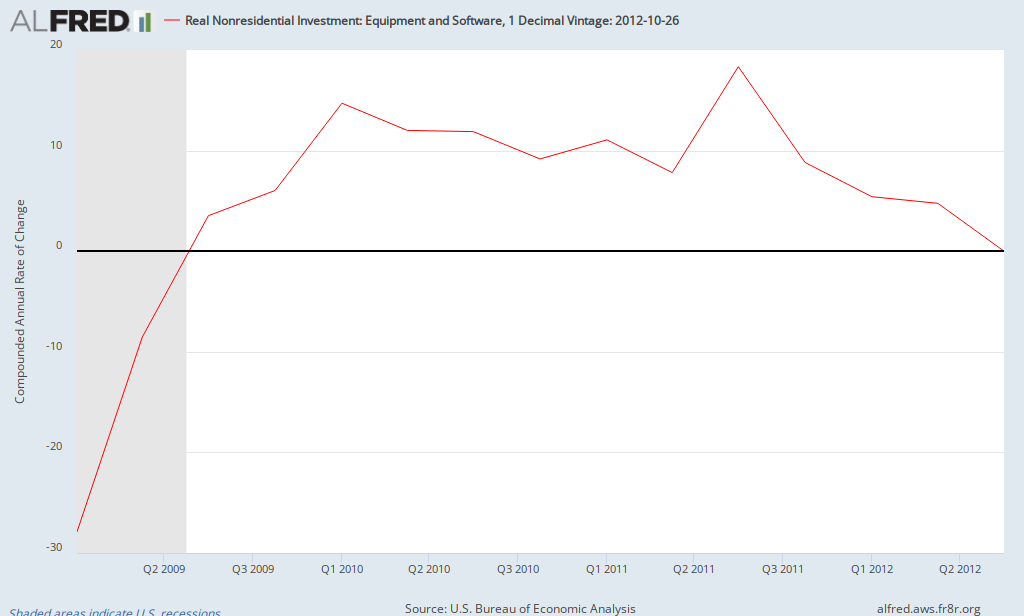
A major reason for this slowdown is the weakness of business investment in equipment and software:

ALFRED Graph

After growing at about a 10% rate in 2010 and 2011 and 5% in the first half of 2012, investment in equipment and software was flat (tiny negative) in the third quarter, the weakest performance since the Spring of 2009 (at the end of the recession).  In addition, exports declined for the first time since the first quarter of 2009, reflecting the global economic slowdown.

What's the takeaway?  The economy continues to struggle, still growing but at a low rate with some signs of increasing weakness in the private sector.

Friday, October 19, 2012

Declining Risk Premium: QE3?

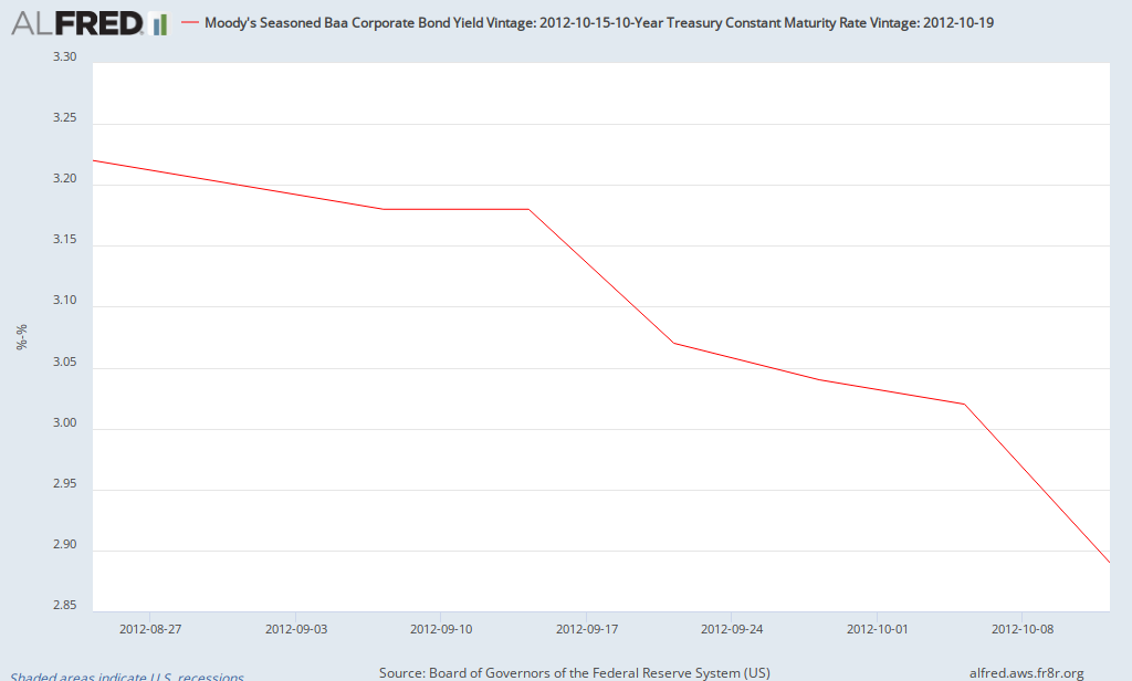
The risk premium on Baa corporate bonds has declined significantly in recent weeks and now stands at 2.72% (as of Thursday Oct 18), the lowest since the summer of 2011.  Here's a chart of its recent behavior (chart is weekly data since Aug 24 (the week before Bernanke's speech at Jackson Hole; doesn't include the decline to 2.72% so far this week):

ALFRED Graph

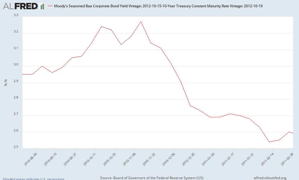
When was the last time it declined this much?

ALFRED Graph

What was taking place during this period (Fall 2010 to early 2011)?  QE2.  Thus, there's evidence that QE2 helped the Baa risk premium to fall by about 0.75%.  So far, QE3 has resulted in a decline in the risk premium of 0.5%.  How long did the decline from QE2 last?  It remained between 2.5% and 2.6% for most of the next 3 months before beginning to rise again in June 2011 (as QE2 came to an end).

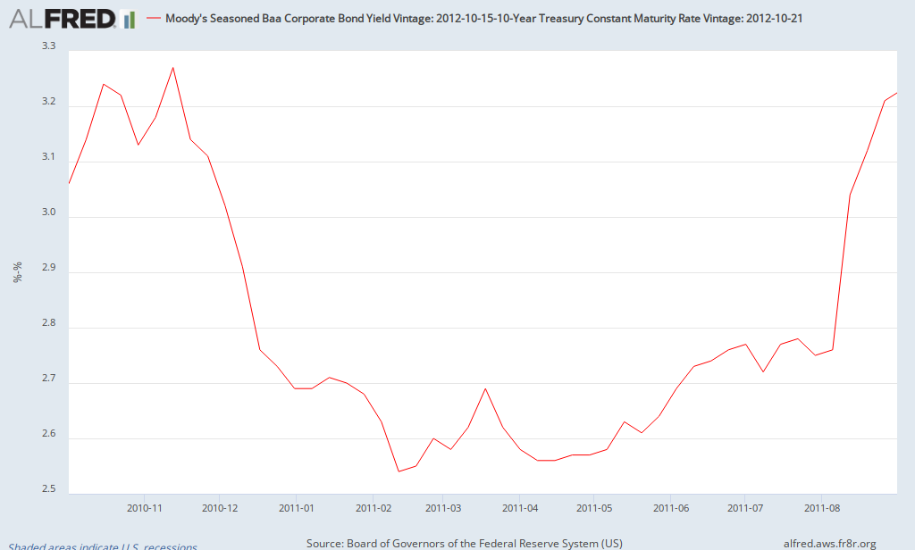
Update:  Here's the rest of the story - a chart that shows the risk premium from the start of QE2 until the debt limit controversy of August 2011 (note: the risk premium was about 2.8% at the end of July 2011 before spiking in August 2011).

ALFRED Graph

The Fed must be happy to see evidence of easing of credit so far due in part to QE3.  Given the open endedness of QE3, will the risk premium continue to decline and remain relatively low (at least compared to recent times)?  We'll have to wait and see.

September Employment Report: Florida & Orlando

This morning, the government released the latest employments report for states and local areas (link to Florida report).  The unemployment rate for Florida dipped slightly to 8.7%.  As with the national numbers, the household survey (used to estimate the unemployment rate) was more positive than the establishment survey (used to estimate the change in payrolls).  For the month, Florida added 800 jobs (though it should be noted that it added 23,900 jobs in August).  The sectors posting the largest gains were Arts, Entertainment & Recreation (up 5000 jobs or 2.7%) and construction, which added 4200 jobs (+1.3%).  This was offset by losses in administrative and waste services, which shed 9400 jobs (state data is seasonally adjusted).

For the second straight month, metro Orlando had a standout sector.  Last month, professional and business services added 6100 jobs.  This month, construction added 3500 jobs (up more than 10%), its largest monthly gain since at least 1990 (that's how far back the BLS data goes for metropolitan areas).  Florida as a whole added 3000 construction jobs in September (not seasonally adjusted), so that entire gain and more was due to Orlando.  Given these recent gains, Orlando now leads the state in employment growth over the last 12 months.  The unemployment rate in Orlando declined to 8.4% (not seasonally adjusted).  When the seasonally adjusted data comes out later this month, it will probably be 8.2 to 8.3%, the lowest since December 2008 (down from a peak of 11.5% in January 2010).  It appears that the Orlando economy may be coming back to life.  Time will tell if these gains continue.

Friday, October 5, 2012

September Job Report

The government released the September job report this morning and there were some surprises.  The headline numbers show that the unemployment rate fell to 7.8% (lowest since January 2009) while 114,000 jobs were added.  How did the unemployment rate fall from 8.1% to 7.8%?  Unlike the last year or two, the labor force participation rate actually rose slightly to 63.6%.  So what happened?  The household survery showed an increase of over 800,000 jobs in September.  However 582,000 of those jobs are due to more people working part-time for economic reasons (which rose from 8 million to 8.6 million people).  That's why that, even though the unemployment declined, the broader measure of unemployment (U6) was unchanged at 14.7%.  On a related note, some have suggested that the household survey may be capturing an increase in self-employed workers which are not fully captured by the establishment survey.  However, using nonseasonally-adjusted numbers, self-employed workers declined by 19,000 (including both incorporated and unincorporated) while total jobs added was 775,000 (based on the household survey).  Thus, a surge in self-employed workers doesn't seem to explain the surge in employment based on the household survey.

Moving over to the establishment survey, the private sector added 104,000 jobs while the government added 10,000.  Leading industries include ambulatory and health services (+29,800), food and accomodation service (+15,700), and state government education (+13,600).  It should be noted that revisions show about 40,000 more jobs created than previously reported in both July and August.

Given the different pictures of the job market presented by the two surveys, let's take a look at charts of employment growth according to each.  The following is a chart of the number of jobs created according to the household survey each month over the last decade.  It should be noted than some of the January numbers are misleading due to adjustments in population control.

An here's the monthly employment gains in private sector payrolls (establishment survey).


As is evident, the establishment survey is much more stable.  Most economists consider the establishment survey to be a more reliable measure of the job market.  So what's my takeaway from this morning's report?  A continuation of modest employment growth (private employment rose by 104,000 in September and 97,000 in August).  The household survey tends to be volatile and seems to be misleading this month.  After accounting for population controls, it showed the most rapid growth in employment since 1983.  One other piece of trivia.  this was the third larvest positive gap between the household and establishment survey (after adjusting for population controls) in the last 50 years.  Did the economy creat anywhere near 873,000 jobs resulting in a significant decline in the unemployment rate?  Not likely.  The payroll number is much more align with most economic data which indicate a sluggish economy which is still experiencing a a slow recovery.


Saturday, September 29, 2012

QE3 after 2 weeks

It's been just over 2 weeks since the Fed announced that it intends to implement a third round of quantitative easing (QE3).  Since I included some of the initial impacts in an argument against QE3, I thought it would be appropriate to provide an update.

What's happened to expected inflation?  Prior to Bernanke's speech in Jackson Hole, Wyoming, during which he indicated the likelihood of QE3, break-even inflation according to the 5-year TIPS was 1.92%.  The day after QE3 was announced, it stood at 2.39% (the highest since summer 2008).  Two weeks later, it's back down to 2.11%.  Thus, as of now, market participants aren't worried about a significant increase in inflation resulting from QE3.

Another gauge of financial conditions that I like to look at is the risk premium on Baa corporate bonds, a measure of the perceived risk of relatively safe companies.  Prior to Bernanke's speech, it stood at 3.2%.  The day before the announcement, it was 3.18%; now it's 3.05% (down from a summer 2012 high of 3.46%).  The last time it was consistently below 3% was in early August 2011 (prior to the debt limit debacle).  What's normal?  Risk premiums of 2% or less were common before the financial crisis (it rose past 6% during the worst part of the crisis).  Is the recent decline due to QE3?  There are probably several factors, but the Fed would be happy to reduce the cost of credit for businesses (and consumers), helping to provide support for a stronger recovery.

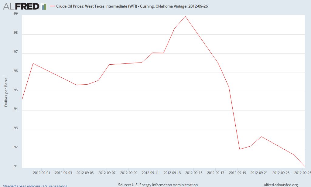
What about oil prices?  Prior to Benanke's speech, the price of a barrel of West Texas Oil was $94.60; it rose to almost $100 per barrel the day after QE3 was announced.  Currently, it's about $92 per barrel.

ALFRED Graph

Of course it's too early to draw conclusions, but so far it's hard to find evidence of a noticeable change in inflation or inflationary expectations as a result of QE3.

This Week's Econonomic Update

There were a few key reports about the economy this week.  Economic growth for the Spring was revised down to 1.3% as both consumer and business spending grew more slowly compared to previous periods.  After contributing 2.5% to economic growth at the end of 2011, inventories have been a drag on growth in the first two quarters of 2012, which is not bad news.  Companies probably found themselves with too much inventory and now are making adjustments to get back in line with consumer spending.  Speaking about consumer spending, it has risen by 1.9% over the last year, contributing to the sluggishness of the recovery.  Over that same period, inflation as measured by the PCE deflator (average price of consumer goods and services in GDP) rose by 1.6%.

On Friday, there was another report about the state of the consumer (updated for August 2012).  Real personal income (real means adjusted for inflation) declined by 0.1% in August while real consumer spending rose by 0.1%.  As a result, the savings rate declined to 3.7% (down from 4.1% in July).  Consumer spending is on pace to grow by about 2% for the third quarter, slightly faster than the Spring.  Meanwhile, consumer prices have risen by 1.5% since August 2011 while core consumer inflation is 1.6%.

Add it up and you still get a sluggish economy with below-average inflation.  The next big economic report is this Friday's report on the job market.  Currently, the consensus is for just over 100,000 jobs created with little change in the unemployment rate.

Friday, September 21, 2012

August Employment Report: Florida & Orlando

This morning, the government released the latest report on the job market for Florida and its counties/cities.  First, the headlines.  The unemployment rate in Florida remained at 8.8% while the state added 23,200 jobs in August (seasonally adjusted).  For Metro Orlando, the unemployment rate declined from 9.1% to 8.7% and the metro area added 17,100 jobs (not seasonally adjusted).

The numbers for Florida are OK.  Employment growth was more rapid than in previous months, but the leading industries were administrative and waste service (which includes temp jobs), accommodation & food services, and construction.  In addition, there was a rebound in private education jobs (remember that the data is seasonally adjusted).  The labor force participation rate declined below 60%, falling from 60.7% in August 2011 to 59.9% in August 2012.  If the participation rate had remained constant over the last year, the unemployment rate would be 10% instead of 8.8%.  Thus, Florida has added jobs in the last year, but most of the decline in the unemployment rate has been due to fewer people participating in the labor force.

Most of the decline in the unemployment rate for metro Orlando is due to seasonal factors, but the seasonally adjust rate will probably show a small decline when reported later this month (the seasonally-adjusted rate was 8.6% in July while the unadjusted rate was 9.1%; the seasonally-adjusted rate will probably be 8.4 or 8.5% in August).  The employment gain of 17,100 was the second largest for the month of August since 1988 (the first year that comparable data was available; only exceeded in 2006).  The gain moved Orlando from year-over-year employment growth of 1% in July to 2.6% in August (making it the fastest growing metro area in Florida).  Of course local government added jobs as public schools reopened (and local data is not seasonally adjusted).  The other sector that stands out is professional and business services, which added 6500 jobs and now is the fastest growing sector over the last year, showing a gain of 4.4% since August 2012.

Some Charactersitics of Poverty in 2011: USA, Florida, Orange County

The Census Bureau released a huge amount of data regarding income and poverty this week, including data at the national, state, and local level.  There's too much to present in a blog post, but here's some highlights that illustrate some key causes of poverty (the source of the data is provided; you're encouraged to dig deeper if you desire).
 
Selective Characteristics of Those in Poverty, 2011
 
 
USA
Florida
Orange County
Poverty rate
Overall
15.9%
17%
18.7%
Education
Less than HS
27.9%
28.4%
25.9%
 
HS Grad
14.2%
16.1%
17.8%
 
Bach. Degree+
4.4%
5.6%
6%
Work Experience
Unemployed
32.6%
34.9%
32.6%
 
Employed
7.4%
8%
10%
 
Year-round FT worker
2.9%
3.3%
3.8%
Marital Status
Married
5.8%
6.9%
7.8%
 
Married (year round FT worker)
2.1%
2.3%
2.1%
 
Female head of household
31.4%
28.9%
29.5%
 
Female head of household (year round FT worker)
10.2%
9.9%
10.9%
A few key factors stand out when considering determinants of poverty.  Some have stated that having a job doesn't ensure that someone escapes poverty.  It doesn't.  However, having a year-round, full-time job sure does help!  Poverty rates for full-time workers range from 2.9% nationally to 3.8% in Orange County.  A similar result occurs for female heads of households: those with full-time employment are much less likely to be in poverty than those without full-time jobs.  A related determinant of poverty is education (people with more education are more likely to be employed).  Those with college degrees have much lower poverty rates than those with just high school degrees or less.
 
What's the take away?  Poverty is a complex issue that requires a multifaceted approach, but policies that strengthen economic growth resulting in more jobs are vital over the next few years.  Improving educational outcomes in general along with efforts to enhance the skills of adults without higher education are critical to reducing poverty over time.  Obviously, there are other policies to be considered and debated, but improving economic growth and education/skills is a good place to start.

Thursday, September 20, 2012

Median Household Income by State, 2011

The Census Bureau released its estimates for median household income by state and metropolitan area this week.  Which states lead and lag the nation?

1-Maryland $70,004                                                           50-Mississippi $36,919
2-Alaska $67,825                                                               49-West Virginia $38,482
3-New Jersey $67,458                                                        48-Arkansas $38,758
4-Connecticut $65,753                                                       47-Kentucky $41,141
5-Massachusetts $62,859                                                   46-Alabama $41,415

One problem with this data is that it doesn't take into account differences in the cost of living between states.  Most people recognize that the cost of living is higher in the northeast and west coast and less expensive elsewhere.  However, there isn't official data regarding differences in the costs of living between states (there are some private estimates).  The Bureau of Economic Analysis recently released estimates of regional pricing parities for the period 2006-2010; this is experimental data designed to capture cost differences at the state and local level.  Note that estimates for 2011 are not available, but 2006-2010 data should still help explain most of the differences in cost of living.  Here's the five most and least expensive states in which to live (US=100):

1-Hawaii 116.1                                                                      50-South Dakota 87.2
2-New York 114.1                                                                 49-North Dakota 88.2
3-New Jersey 111.5                                                              47-Missouri 88.7
4-California 110.7                                                                 47-West Virginia 88.7
5-Connecticut 110.5                                                             46-Mississippi 88.9

What happens to median household income by state after adjusting for differences in the cost of living?

1-Alaska $63,925                                                                 50-Mississippi $42,529
2-Maryland $63,467                                                             49-West Virginia $43,384
3-New Jersey $60,500                                                          48-Arkansas $43,402
4-Virginia $60,021                                                                47-Florida $44,299
5-Connecticut $59,505                                                         46-New Mexico $44,594

The top three and bottom three remain the same, but the gap between them declines.  The Dakotas benefitted the most from the low cost of living, with North Dakota moving from 20th to 9th, once one takes into account its low cost of living.  Meanwhile, New York fell from 16th to 32nd.  A surprise to some may be Florida having the 4th lowest median household income, after adjusting for cost of living.

Estimates of poverty at the state and local level are also distorted by cost of living differences (i.e., it's hard to use a national standard when the cost of living differs significantly between states, but that's the approach used when determing official estimates of poverty).  That's a story for another day...