Let's take a look back at some of the economic news from this week. First, in response to some turmoil in financial markets, several members of the FOMC tried to clarify the remarks Ben Bernanke made following the Fed's most recent meeting while some commentators complained that Bernanke was not clear and the Fed had a communication problem. Fed members said what Bernanke meant was that the Fed plans to begin reducing QE3 (tapering) once the economy strengthens further, using a 7% unemployment rate as a guidepost. Tapering isn't immediate, but would probably begin later this year, assuming Fed forecasts turn out to be correct, and QE3 will completely end next year. They emphasized that it's data dependent, so if the economy is weaker than expected, QE3 would continue for a longer period of time. They also emphasized that tapering shouldn't be confused with an increase in the federal funds rate, which is unlikely until 2015. How does this differ from what Bernanke said (see previous post)? What he said was basically:
The Fed plans to begin reducing QE3 (tapering) once the economy strengthens further, using a 7% unemployment rate as a guidepost. Tapering isn't immediate, but would probably begin later this year, assuming Fed forecasts turn out to be correct, and be QE3 would completely end next year. It's data dependent, so if the economy is weaker than expected, QE3 would continue for a longer period of time. Tapering shouldn't be confused with an increase in the federal funds rate, which is unlikely until 2015.
If you can't tell the difference, that's OK; they just repeated what Bernanke had already said. From my perspective, it was hard to misinterpret Bernanke (there must have been some hidden signal; saying that rates would rise in 2015 probably meant 2014, ...). Why didn't the Fed just say tapering would begin in September (or December) and QE3 would end in June 2014? Because QE3 is designed to strengthen the economy and reduce unemployment. If it needs to be in place a little longer to achieve the goal, it'll be extended (tapering beginning in 2014 instead of late 2013, etc.). So making tapering of QE3 dependent on the state of the economy makes perfect sense. As a reminder, I'm a skeptic of QE3 (see here and here), so I'm not defending the policy.
So why did markets react they way they did to Bernanke's hints in May and his remarks following the most recent Fed meeting? First, let me point you to a post prior to the Fed's meeting about rising real interest rates. Since QE3 involves Fed purchases of bonds, some investors thought it would be a good idea to buy the bonds before the Fed did (since demand from the Fed would increase bond prices, it makes sense to buy the bonds first so you can benefit from the price increase). Also, negative real interest rates caused many investors to seek better returns in riskier assets. Once the reality sunk in that QE3 wouldn't go on forever and interest rates started to increase, these trades reversed. As a result, interest rates spiked and asset prices declined, particularly on riskier assets such as emerging markets. I don't think this represented investors thinking that the Fed going to end QE3 immediately or increase the federal funds rate soon, but instead represented the unwinding of speculation. There's a lot less speculative excesses in financial markets now compared to a month ago, which is a good thing for the future (makes new bubbles less likely).
What is the likely impact of the spike in interest rates on the economy? That will be addressed in a future post. What's the key takeaway from what's happened in financial markets in recent weeks? In an era of record low interest rates (near zero on safe assets), many investors took on greater risk than they would normally prefer in order to achieve a higher return. The reality of QE3 ending at some point in the foreseeable future along with the subsequent increase in real interest rates caused investors to better appreciate the riskiness of their investments, which is a good thing over time (though it may hurt in the short run).
Saturday, June 29, 2013
Friday, June 21, 2013
May Employment Report: Florida and Orlando
The latest report about the job market in Florida and its localities was released this morning. The headlines are that the unemployment rate for Florida is 7.1%, the lowest since September 2008. Is the job market as good as it was back then? Not quite. Though progress has been made in recent years, we are still a long way from 2008. Florida is still down 137,000 jobs since September 2008 and has about 550,000 fewer jobs than before the recession. How has the unemployment rate declined so much even though employment is still lagging? The labor force participation rate has declined from about 64% before the recession to 60.3% in May 2013. Thus, most of the decline in the unemployment rate in recent years has been due to a smaller percentage of people participating in the job market.
What sectors have experienced the strongest employment growth in the last year? Interest-sensitive sectors - housing and autos. Areas with the fastest employment growth include construction, auto dealers, building supply stores, and real estate. In terms of absolute numbers, food and drinking places added the most jobs statewide over the last year, up 26,700. What about the most recent month? Florida actually lost jobs, mainly due to a decline on construction, which gave back some of its recent gains.
Unlike statewide, the data released today for metropolitan areas were not seasonally adjusted. Orlando showed no change in employment while the unemployment rate ticked up a little, to 6.6%. The seasonally-adjusted unemployment rate will be released in a few weeks and will likely indicate little change in the unemployment rate (close to 6.9%; this estimate is based on historical seasonal adjustments). Over the last year, a majority of the jobs created locally have been in leisure and hospitality (8500 out of 16,800), led by food and drinking places, the fastest growing category over the last 12 months (up 6%).
What are the key takeaways from today's report? The Florida economy continues to heal, but employment growth remains modest. The rate of employment growth in Orlando, Florida and the United States were roughly equal at about 1.6 to 1.7% over the last year.
Wednesday, June 19, 2013
The Fed's Latest Announcement Regarding the Direction of Monetary Policy
As expected, the Fed announced this afternoon that it will continue QE3 without tapering, for now. In addition, it released its latest forecasts for the economy. What are the headlines? During the press conference following the announcement, Ben Bernanke said that, if the Fed forecast turns out to be correct, the Fed will probably begin tapering its purchases of bonds later this year and end QE3 by mid-2014. Also, a large majority of FOMC participants anticipate the federal funds rate beginning to increase in 2015. The initial response of the market has been a sharp decline in stocks and a significant increase in interest rates with the ten-year bond rising to 2.33%, the highest since March 2012.
Let's take a closer look at the Fed's view of the economy. First, it should be noted that the projections are those of each of the 12 district banks, not the Federal Reserve itself (i.e., not the Board of Governors or Ben Bernanke). The table below show the central tendency of the forecasts, which is the range of forecasts after eliminating the 3 highest and 3 lowest forecasts for each variable.
note: the forecast for the unemployment rate is for the end of the year
In addition to the forecasts, the Fed noted that it thinks the downside risks to the economy have subsided (less risk of a slowdown). The forecast for economic growth for all 3 years is somewhat more optimistic than that of most private forecasts, but the other forecasts are in line with other forecasts. What are the implications for monetary policy? The Fed has announced thresholds (their word, not mine) for inflation (forecast above 2.5%, 1-2 years in the future; it relies on a forecast of inflation since it takes time for monetary policy to impact inflation) and the unemployment rate (6.5%) for when they are likely to consider increasing the federal funds rate. Today, Ben Bernanke suggested that QE3 would likely end as the unemployment rate reached 7%. Given that the Fed expects the unemployment rate to reach 7% in Spring/Summer 2014, QE3 will likely end around that time (if their forecast is correct). Since it will preceded by a gradual reduction in bond purchases, the tapering will likely begin in late 2013. Ben Bernanke emphasized that if the data shows a slower economy (including a higher than expected unemployment rate), QE3 could be extended further into 2014 (and thus tapering may not start until sometime in 2014).
What are the key takeaways from the latest news from the Fed? It is more confident about the strength of the economy, but still thinks it requires stimulus. In addition, it provided some clarification as to when it would begin to taper and eventually end QE3, though the exact timing is dependent on the data. As of now, it expects that tapering will begin later this year with QE3 coming to an end by this time next year.
Let's take a closer look at the Fed's view of the economy. First, it should be noted that the projections are those of each of the 12 district banks, not the Federal Reserve itself (i.e., not the Board of Governors or Ben Bernanke). The table below show the central tendency of the forecasts, which is the range of forecasts after eliminating the 3 highest and 3 lowest forecasts for each variable.
|
|
2013
|
2014
|
2015
|
|
Economic growth
|
2.3 to 2.6%
|
3 to 3.5%
|
2.9 to 3.6%
|
|
Unemployment rate
|
7.2 to 7.3%
|
6.5 to 6.8%
|
5.8 to 6.2%
|
|
inflation
|
0.8 to 1.2%
|
1.4 to 2%
|
1.6 to 2%
|
In addition to the forecasts, the Fed noted that it thinks the downside risks to the economy have subsided (less risk of a slowdown). The forecast for economic growth for all 3 years is somewhat more optimistic than that of most private forecasts, but the other forecasts are in line with other forecasts. What are the implications for monetary policy? The Fed has announced thresholds (their word, not mine) for inflation (forecast above 2.5%, 1-2 years in the future; it relies on a forecast of inflation since it takes time for monetary policy to impact inflation) and the unemployment rate (6.5%) for when they are likely to consider increasing the federal funds rate. Today, Ben Bernanke suggested that QE3 would likely end as the unemployment rate reached 7%. Given that the Fed expects the unemployment rate to reach 7% in Spring/Summer 2014, QE3 will likely end around that time (if their forecast is correct). Since it will preceded by a gradual reduction in bond purchases, the tapering will likely begin in late 2013. Ben Bernanke emphasized that if the data shows a slower economy (including a higher than expected unemployment rate), QE3 could be extended further into 2014 (and thus tapering may not start until sometime in 2014).
What are the key takeaways from the latest news from the Fed? It is more confident about the strength of the economy, but still thinks it requires stimulus. In addition, it provided some clarification as to when it would begin to taper and eventually end QE3, though the exact timing is dependent on the data. As of now, it expects that tapering will begin later this year with QE3 coming to an end by this time next year.
Monday, June 17, 2013
Recent Trends in Income for Florida and Orlando
Last week, the Bureau of Economic Analysis (BEA) released the latest estimates for state and metropolitan personal income (overall and per capita; both figures in real terms; i.e., adjusted for inflation). I exchanged a series of emails with a reporter from the Orlando Sentinel, but only a very small portion was included in the story, so I decided to include more of the details in this post.
After declining by nearly 7% in 2009, real personal income in Florida is recovering (up 3.7% in 2010 and 2.2% in 2011, the latest year for which data are available). As of 2011, it was still below where it had been in 2007. Likewise, real personal income per capita (i.e., real personal income divided by population, not the same as income per worker) is slowly recovering from a steep decline in 2009 (down 7.5% in 2009, up 2.7% and 1% in 2010 and 2011, respectively). As of 2011, it was still down just over 5% from 2007. Inflation in Florida was slightly lower than the US as a whole, averaging 1.6% from 2007-2011 compared to 1.9% for the US.
The performance of Metro Orlando mirrored that of the state as real personal income rose 3.4% and 2.7% in 2010 and 2011, respectively, while real personal income per capita rose by 2.1% and 1.2%. The ratio of real personal income per capita in Orlando compared to the nation as a whole remained steady from 2009-2011 at about 87%.
How does Orlando compare to other metropolitan areas in Florida? Here's a table comparing some of the metropolitan areas in Florida.
Per capita Income by Metropolitan Area: overall and by Type for 2011
note: add rows 2-4 to get row 1; data are not inflation adjusted
The headline number shows Orlando lagging behind other metro areas, but the reason is somewhat surprising. While earnings explain some of the underperformance, the major reason is weakness in dividends, interest, and rental income. For example, while earnings per capita are higher in Orlando than Tampa, personal income per capita is 10% higher in Tampa due to higher dividends/interest/rent and higher transfer payments. Earnings in Orlando also lag behind Jacksonville and Miami, but once again, the other forms of income, particularly dividend/interest/rent, play a more significant role.
What explains the relatively low level of dividends/interest/rent in Orlando? One possible reason is a smaller amount of wealth due in part to a younger population. The median age in Orlando is 33 compared to 39 in Miami and 35 in both Jacksonville and Tampa (different sources provide slightly different estimates). Other factors also play a role, but that's a subject for another day.
What are the key takeaways? Income in Florida is slowly recovered from the damage suffered during the Great Recession. Also, differences in per capita income reflect not only differences in earnings but also in unearned income, including income from wealth and government transfer payments.
After declining by nearly 7% in 2009, real personal income in Florida is recovering (up 3.7% in 2010 and 2.2% in 2011, the latest year for which data are available). As of 2011, it was still below where it had been in 2007. Likewise, real personal income per capita (i.e., real personal income divided by population, not the same as income per worker) is slowly recovering from a steep decline in 2009 (down 7.5% in 2009, up 2.7% and 1% in 2010 and 2011, respectively). As of 2011, it was still down just over 5% from 2007. Inflation in Florida was slightly lower than the US as a whole, averaging 1.6% from 2007-2011 compared to 1.9% for the US.
The performance of Metro Orlando mirrored that of the state as real personal income rose 3.4% and 2.7% in 2010 and 2011, respectively, while real personal income per capita rose by 2.1% and 1.2%. The ratio of real personal income per capita in Orlando compared to the nation as a whole remained steady from 2009-2011 at about 87%.
How does Orlando compare to other metropolitan areas in Florida? Here's a table comparing some of the metropolitan areas in Florida.
Per capita Income by Metropolitan Area: overall and by Type for 2011
Jacksonville
|
Miami
|
Orlando
|
Tampa
|
|
Personal
income
|
$40,709
|
$43,072
|
$35,535
|
$39,261
|
Personal income
from earnings from work by place of residence
|
$25,837
|
$24,543
|
$22,969
|
$22,201
|
Dividends,
Interest, and Rent
|
$7,712
|
$10,601
|
$5,695
|
$8,810
|
Current
Transfers
|
$7,160
|
$7,928
|
$6,872
|
$8,249
|
The headline number shows Orlando lagging behind other metro areas, but the reason is somewhat surprising. While earnings explain some of the underperformance, the major reason is weakness in dividends, interest, and rental income. For example, while earnings per capita are higher in Orlando than Tampa, personal income per capita is 10% higher in Tampa due to higher dividends/interest/rent and higher transfer payments. Earnings in Orlando also lag behind Jacksonville and Miami, but once again, the other forms of income, particularly dividend/interest/rent, play a more significant role.
What explains the relatively low level of dividends/interest/rent in Orlando? One possible reason is a smaller amount of wealth due in part to a younger population. The median age in Orlando is 33 compared to 39 in Miami and 35 in both Jacksonville and Tampa (different sources provide slightly different estimates). Other factors also play a role, but that's a subject for another day.
What are the key takeaways? Income in Florida is slowly recovered from the damage suffered during the Great Recession. Also, differences in per capita income reflect not only differences in earnings but also in unearned income, including income from wealth and government transfer payments.
Thursday, June 13, 2013
Higher Real Interest Rates
After a period of stability, financial markets have become volatile once again, led by major declines in the stock markets of many emerging markets and Japan. One of the reasons cited is the rise in interest rates (for example, the yield on the ten-year US bond has risen by 0.5% in a short time). What is the bond market telling us? By examining the market for TIPS (Treasury Inflation Protected Securities), we can decompose the rise in bond yields into two components: break-even inflation and the real interest rate. The yield on the TIPS represents the real interest rate (interest rate adjusted for inflation) since investors holding TIPS earn the yield plus are compensated for whatever inflation turns out to be. Break-even inflation is the difference between the yield on a traditional Treasury and the comparable TIPS. Some economists use it as a proxy for expected inflation (technically, one must adjust it for the inflation risk premium to obtain the market's expectation of inflation, but we'll save that for another day).
Why have interest rates risen recently? An increase in real interest rates. Here's a chart of the yield on ten-year TIPS (red line) and break-even inflation (green line) over the last 5 years (daily data):
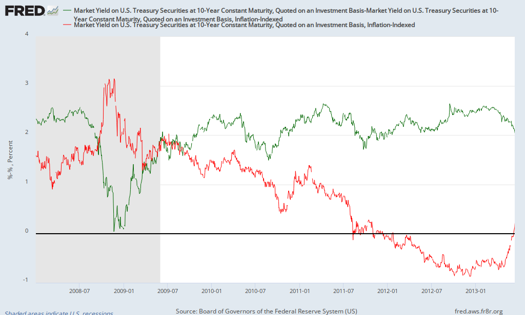
While break-even inflation has declined recently, you'll notice that, after being negative since late 2011, the real interest rate just turned positive in recent days (and has risen significantly over the last month; from -0.68 at the end of April to 0.21 on June 12). What's the significance of the change in real interest rates? Here's an interesting chart of the S&P 500 (blue line) and the real interest rate as estimated by the yield on 10-year TIPS (green line):

Over the last 5 years, the correlation between the S&P500 and the yield on 10-year TIPS is -0.8; a strong negative relationship. The most likely explanation for it is low or negative real interest rates motivate investors to seek better returns elsewhere, including the stock market. Of course there are other factors that are affecting stock prices, but low/negative real interest rates due in part to QE seem to be having a significant impact. It appears that investors are right to be concerned about impact of the Fed scaling back QE. Of course, there's still considerable uncertainty as to when will begin to reduce its bond purchases as well as how quickly it'll phase out QE (will it go from $85 billion a month to $0 in a few months or over a much longer period of time).
In the five years before the financial crisis (June 2003-June 2008), the yield on 10-year TIPS averaged 2%. Though they won't necessarily rise back to that level, if real interest rates continue to normalize (rise somewhat), one can expect continued volatility in financial markets. It should be noted that the correlation between real interest rates and the stock market prior to the crisis (2003-2008) was small and slightly positive, so once real rates stabilize at a higher level, they should cease being a hindrance to the stock market.
Why have interest rates risen recently? An increase in real interest rates. Here's a chart of the yield on ten-year TIPS (red line) and break-even inflation (green line) over the last 5 years (daily data):
While break-even inflation has declined recently, you'll notice that, after being negative since late 2011, the real interest rate just turned positive in recent days (and has risen significantly over the last month; from -0.68 at the end of April to 0.21 on June 12). What's the significance of the change in real interest rates? Here's an interesting chart of the S&P 500 (blue line) and the real interest rate as estimated by the yield on 10-year TIPS (green line):
Over the last 5 years, the correlation between the S&P500 and the yield on 10-year TIPS is -0.8; a strong negative relationship. The most likely explanation for it is low or negative real interest rates motivate investors to seek better returns elsewhere, including the stock market. Of course there are other factors that are affecting stock prices, but low/negative real interest rates due in part to QE seem to be having a significant impact. It appears that investors are right to be concerned about impact of the Fed scaling back QE. Of course, there's still considerable uncertainty as to when will begin to reduce its bond purchases as well as how quickly it'll phase out QE (will it go from $85 billion a month to $0 in a few months or over a much longer period of time).
In the five years before the financial crisis (June 2003-June 2008), the yield on 10-year TIPS averaged 2%. Though they won't necessarily rise back to that level, if real interest rates continue to normalize (rise somewhat), one can expect continued volatility in financial markets. It should be noted that the correlation between real interest rates and the stock market prior to the crisis (2003-2008) was small and slightly positive, so once real rates stabilize at a higher level, they should cease being a hindrance to the stock market.
Friday, June 7, 2013
May Employment Report
The headlines from the May employment report are that the unemployment rate rose to 7.6% while the economy added 175,000 jobs (178,000 in the private sector). But what about the underlying details? Nothing that dramatic. The broad measure of unemployment (U6) declined to 13.8% while the labor force participation rate rose to 63.4% (from a 34-year low of 63.3%). Aggregate hours worked, which had declined in April, rose in May. All of these numbers are mildly positive. Where was the job growth? Food services and drinking places added 38,100 jobs, retail trade added 27,700 and temp agencies added 25,600. Together, these three sectors represent about 20% of all jobs, but more than half of net job creation in May (and April); they are also relatively low-paying sectors of the economy. That is one reason why average hourly earnings were flat this month.
What else can we learn from this report? Since May 2012, the unemployment rate has declined from 8.2% to 7.6%. However, the unemployment rate rose for teenagers as well as those in their early 20s while the largest declines occurred for those above the age of 55 and those between 25 and 34. As can be seen in the chart below, the unemployment rate is inversely related to age:
What's the key takeaway from the report? The job market continues to heal at a modest rate, with disproportionate employment growth in relatively low-paying occupations.
What else can we learn from this report? Since May 2012, the unemployment rate has declined from 8.2% to 7.6%. However, the unemployment rate rose for teenagers as well as those in their early 20s while the largest declines occurred for those above the age of 55 and those between 25 and 34. As can be seen in the chart below, the unemployment rate is inversely related to age:
|
Age
|
Unemployment Rate
|
|
16-19
|
24.5%
|
|
20-24
|
13.2%
|
|
25-34
|
7.2%
|
|
35-44
|
6.2%
|
|
45-54
|
5.9%
|
|
55+
|
5.3%
|
What's the key takeaway from the report? The job market continues to heal at a modest rate, with disproportionate employment growth in relatively low-paying occupations.
Subscribe to:
Posts (Atom)