Saturday, September 29, 2012

QE3 after 2 weeks

It's been just over 2 weeks since the Fed announced that it intends to implement a third round of quantitative easing (QE3).  Since I included some of the initial impacts in an argument against QE3, I thought it would be appropriate to provide an update.

What's happened to expected inflation?  Prior to Bernanke's speech in Jackson Hole, Wyoming, during which he indicated the likelihood of QE3, break-even inflation according to the 5-year TIPS was 1.92%.  The day after QE3 was announced, it stood at 2.39% (the highest since summer 2008).  Two weeks later, it's back down to 2.11%.  Thus, as of now, market participants aren't worried about a significant increase in inflation resulting from QE3.

Another gauge of financial conditions that I like to look at is the risk premium on Baa corporate bonds, a measure of the perceived risk of relatively safe companies.  Prior to Bernanke's speech, it stood at 3.2%.  The day before the announcement, it was 3.18%; now it's 3.05% (down from a summer 2012 high of 3.46%).  The last time it was consistently below 3% was in early August 2011 (prior to the debt limit debacle).  What's normal?  Risk premiums of 2% or less were common before the financial crisis (it rose past 6% during the worst part of the crisis).  Is the recent decline due to QE3?  There are probably several factors, but the Fed would be happy to reduce the cost of credit for businesses (and consumers), helping to provide support for a stronger recovery.

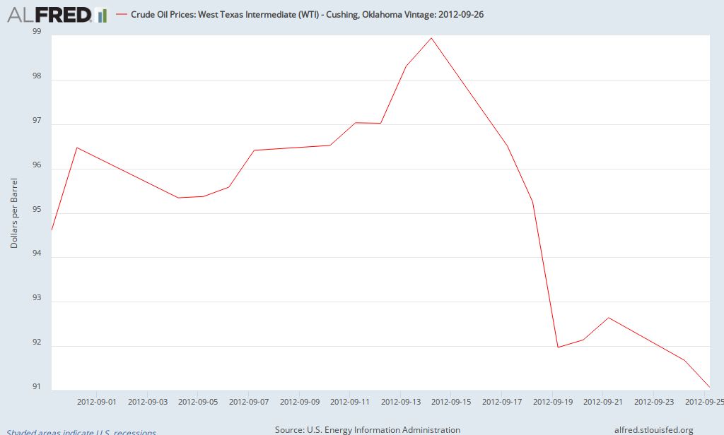
What about oil prices?  Prior to Benanke's speech, the price of a barrel of West Texas Oil was $94.60; it rose to almost $100 per barrel the day after QE3 was announced.  Currently, it's about $92 per barrel.

ALFRED Graph

Of course it's too early to draw conclusions, but so far it's hard to find evidence of a noticeable change in inflation or inflationary expectations as a result of QE3.

This Week's Econonomic Update

There were a few key reports about the economy this week.  Economic growth for the Spring was revised down to 1.3% as both consumer and business spending grew more slowly compared to previous periods.  After contributing 2.5% to economic growth at the end of 2011, inventories have been a drag on growth in the first two quarters of 2012, which is not bad news.  Companies probably found themselves with too much inventory and now are making adjustments to get back in line with consumer spending.  Speaking about consumer spending, it has risen by 1.9% over the last year, contributing to the sluggishness of the recovery.  Over that same period, inflation as measured by the PCE deflator (average price of consumer goods and services in GDP) rose by 1.6%.

On Friday, there was another report about the state of the consumer (updated for August 2012).  Real personal income (real means adjusted for inflation) declined by 0.1% in August while real consumer spending rose by 0.1%.  As a result, the savings rate declined to 3.7% (down from 4.1% in July).  Consumer spending is on pace to grow by about 2% for the third quarter, slightly faster than the Spring.  Meanwhile, consumer prices have risen by 1.5% since August 2011 while core consumer inflation is 1.6%.

Add it up and you still get a sluggish economy with below-average inflation.  The next big economic report is this Friday's report on the job market.  Currently, the consensus is for just over 100,000 jobs created with little change in the unemployment rate.

Friday, September 21, 2012

August Employment Report: Florida & Orlando

This morning, the government released the latest report on the job market for Florida and its counties/cities.  First, the headlines.  The unemployment rate in Florida remained at 8.8% while the state added 23,200 jobs in August (seasonally adjusted).  For Metro Orlando, the unemployment rate declined from 9.1% to 8.7% and the metro area added 17,100 jobs (not seasonally adjusted).

The numbers for Florida are OK.  Employment growth was more rapid than in previous months, but the leading industries were administrative and waste service (which includes temp jobs), accommodation & food services, and construction.  In addition, there was a rebound in private education jobs (remember that the data is seasonally adjusted).  The labor force participation rate declined below 60%, falling from 60.7% in August 2011 to 59.9% in August 2012.  If the participation rate had remained constant over the last year, the unemployment rate would be 10% instead of 8.8%.  Thus, Florida has added jobs in the last year, but most of the decline in the unemployment rate has been due to fewer people participating in the labor force.

Most of the decline in the unemployment rate for metro Orlando is due to seasonal factors, but the seasonally adjust rate will probably show a small decline when reported later this month (the seasonally-adjusted rate was 8.6% in July while the unadjusted rate was 9.1%; the seasonally-adjusted rate will probably be 8.4 or 8.5% in August).  The employment gain of 17,100 was the second largest for the month of August since 1988 (the first year that comparable data was available; only exceeded in 2006).  The gain moved Orlando from year-over-year employment growth of 1% in July to 2.6% in August (making it the fastest growing metro area in Florida).  Of course local government added jobs as public schools reopened (and local data is not seasonally adjusted).  The other sector that stands out is professional and business services, which added 6500 jobs and now is the fastest growing sector over the last year, showing a gain of 4.4% since August 2012.

Some Charactersitics of Poverty in 2011: USA, Florida, Orange County

The Census Bureau released a huge amount of data regarding income and poverty this week, including data at the national, state, and local level.  There's too much to present in a blog post, but here's some highlights that illustrate some key causes of poverty (the source of the data is provided; you're encouraged to dig deeper if you desire).
 
Selective Characteristics of Those in Poverty, 2011
 
 
USA
Florida
Orange County
Poverty rate
Overall
15.9%
17%
18.7%
Education
Less than HS
27.9%
28.4%
25.9%
 
HS Grad
14.2%
16.1%
17.8%
 
Bach. Degree+
4.4%
5.6%
6%
Work Experience
Unemployed
32.6%
34.9%
32.6%
 
Employed
7.4%
8%
10%
 
Year-round FT worker
2.9%
3.3%
3.8%
Marital Status
Married
5.8%
6.9%
7.8%
 
Married (year round FT worker)
2.1%
2.3%
2.1%
 
Female head of household
31.4%
28.9%
29.5%
 
Female head of household (year round FT worker)
10.2%
9.9%
10.9%
A few key factors stand out when considering determinants of poverty.  Some have stated that having a job doesn't ensure that someone escapes poverty.  It doesn't.  However, having a year-round, full-time job sure does help!  Poverty rates for full-time workers range from 2.9% nationally to 3.8% in Orange County.  A similar result occurs for female heads of households: those with full-time employment are much less likely to be in poverty than those without full-time jobs.  A related determinant of poverty is education (people with more education are more likely to be employed).  Those with college degrees have much lower poverty rates than those with just high school degrees or less.
 
What's the take away?  Poverty is a complex issue that requires a multifaceted approach, but policies that strengthen economic growth resulting in more jobs are vital over the next few years.  Improving educational outcomes in general along with efforts to enhance the skills of adults without higher education are critical to reducing poverty over time.  Obviously, there are other policies to be considered and debated, but improving economic growth and education/skills is a good place to start.

Thursday, September 20, 2012

Median Household Income by State, 2011

The Census Bureau released its estimates for median household income by state and metropolitan area this week.  Which states lead and lag the nation?

1-Maryland $70,004                                                           50-Mississippi $36,919
2-Alaska $67,825                                                               49-West Virginia $38,482
3-New Jersey $67,458                                                        48-Arkansas $38,758
4-Connecticut $65,753                                                       47-Kentucky $41,141
5-Massachusetts $62,859                                                   46-Alabama $41,415

One problem with this data is that it doesn't take into account differences in the cost of living between states.  Most people recognize that the cost of living is higher in the northeast and west coast and less expensive elsewhere.  However, there isn't official data regarding differences in the costs of living between states (there are some private estimates).  The Bureau of Economic Analysis recently released estimates of regional pricing parities for the period 2006-2010; this is experimental data designed to capture cost differences at the state and local level.  Note that estimates for 2011 are not available, but 2006-2010 data should still help explain most of the differences in cost of living.  Here's the five most and least expensive states in which to live (US=100):

1-Hawaii 116.1                                                                      50-South Dakota 87.2
2-New York 114.1                                                                 49-North Dakota 88.2
3-New Jersey 111.5                                                              47-Missouri 88.7
4-California 110.7                                                                 47-West Virginia 88.7
5-Connecticut 110.5                                                             46-Mississippi 88.9

What happens to median household income by state after adjusting for differences in the cost of living?

1-Alaska $63,925                                                                 50-Mississippi $42,529
2-Maryland $63,467                                                             49-West Virginia $43,384
3-New Jersey $60,500                                                          48-Arkansas $43,402
4-Virginia $60,021                                                                47-Florida $44,299
5-Connecticut $59,505                                                         46-New Mexico $44,594

The top three and bottom three remain the same, but the gap between them declines.  The Dakotas benefitted the most from the low cost of living, with North Dakota moving from 20th to 9th, once one takes into account its low cost of living.  Meanwhile, New York fell from 16th to 32nd.  A surprise to some may be Florida having the 4th lowest median household income, after adjusting for cost of living.

Estimates of poverty at the state and local level are also distorted by cost of living differences (i.e., it's hard to use a national standard when the cost of living differs significantly between states, but that's the approach used when determing official estimates of poverty).  That's a story for another day...

Friday, September 14, 2012

The Case Against QE3

I made a case in favor of QE3, so now it's time to make the case against QE3.  As with any policy, there are costs as well as benefits.  The arguments in favor of QE3 emphasize the potential long-term damage that could result from a permanent increase in unemployment.  However, there is reason to doubt about how much QE3 will reduce unemployment.  Interest rates in general and mortgage rates in particular are at historic lows.  How much lower will they go as a result of QE3?  We'll see.  But rates will have to decline significantly to have a noticeable impact on the housing market.  A decline of 0.25% or less is unlikely to have a significant impact.  The already low interest rates have helped corporations and many mortgage holders to refinance, helping to strengthen their balance sheets.  Another small decline in mortgage rates is unlikely to have much of an impact.

In addition, the Fed has tried to limit its purchases of securities to short-term Treasuries to avoid introducing distortions to financial markets.  In other words, buying mortgage-backed securities will artificially reduce mortgage rates until the Fed withdraws the stimulus sometime in the future (2015?).  When that occurs, there's likely to be a higher than normal increase in interest rates (including mortgage rates) as rates rise from artificially low levels (in addition to increasing due to economic strenghening).  At that point, lenders will have a considerable amount of mortgages with low interest rates locked in while they'll need to start paying higher rates on deposits.  In addition, people with low mortgage rates will be somewhat reluctant to move, knowing that they'll have to pay a higher interest rate when buying a new house (of course many people will have to move for a new job, etc., but this will reduce the amount of "voluntary" moves).

Though lower interest rates increases the demand for loans, they may discourage lenders from making loans if it reduces the spread (lenders earn profits based on the difference between what they earn on loans and what they pay for funds).  Smaller spreads may encourage lenders to focus on prime customers.

What about inflation?  Prior to Ben Bernake's speech at the Jackson Hole conference on August 31, break-even inflation using 5-year TIPS was 1.92%.  On Wednesday, September 12, it was 2.12% (Friday evening update: it rose to 2.39% on Friday; the highest since the summer of 2008; the break-even inflation rate using 10-year TIPS is 2.64%, the highest since 2006).  Thus, in anticipation of QE3, expected inflation has risen somewhat (highest since May 2011).  CPI inflation is running at 1.7% over the last 12 months while core CPI inflation is 1.9%, as close as you can get to the Fed's target of 2%.  So unlike prior to QE1 and QE2, neither inflation nor break-even inflation is considerably below the 2% target (click here for details).

Is QE3 responsible for high oil prices?  Not yet.  Here's a chart showing the behavior of oil prices since June 2012:

ALFRED Graph

As can be seen, most of the recent increase occurred prior to Bernanke's speech in Jackson Hole.  Prior to the speech, oil sold for about $94.60 per barrel; as of Friday morning, September 14, it's $99.50 per barrel.  Some of the increase can be attributed to turmoil in the Middle East while some is due to increased speculation due in part to QE3.

Clearly, there's a lot to be considered, but I'll address one last topic - the Fed's exit strategy.  This was a hot topic about a year ago (the Fed even began to test methods that could be used to remove reserves in the future).  Given the extraordinary size of the Fed's balance sheet, making it even large increases the complexity of any exit strategy.  In other words, removing $3 trillion of excess reserves is more difficult than removing $2 trillion of excess reserves.  Removal of excess liquidity needs to be done with care - not too soon (hurting the recovery) but not too late (increasing inflation).  As mentioned earlier, distortions in financial markets resulting in artificially low rates will disappear when the Fed implements its exit strategy.  The more the distortion, the harder the adjustment back to normal conditions (and the Fed is hoping for significant distortion in order for the policy to be effective).

Add it up and I think the costs exceed the benefits.  If financial markets locked up again due to a European implosion or if fears of deflation started to take hold, additional QE would be justified.  However, given sluggish growth (which is still growth), inflation close to its target, and the limited impact, I would not have voted for QE3.

The Case for QE3

Let me begin by repeating that I would have voted against QE3.  That said, Ben Bernanke is a very good economist with honorable intentions, so there's some good reasons for it.  Here's the case for QE3.

The key aspect of QE3 involve the intent to purchase $40 billion worth of mortgage-backed securities as long as the unemployment rate remains high and even as the economy begins to strengthen.  That tells us a few points behind the rationale.  Of course the weakness of the recovery is reason for further stimulus, but the design of QE3 suggests a significant concern about the long-run behavior of the labor market.  Ben Bernanke and others on the Fed fear hysteresis.  What's that?  It occurs when a significant number of the unemployed remain out of work for an extended period of time, rendering them unemployable.  Thus, short-term unemployment resulting from a recession results in long-term unemployment which becomes a permanent fixture of the economy.  That could mean they leave the labor force and don't come back (witness the significant decline in the labor force paritcipation rate in recent years) or they remain in the labor force and become structurally unemployed (want a job but aren't qualified for the jobs that are available).  As a resuslt, the "normal" unemployment rate (what economists call the natural rate or NAIRU) rises.  A consensus seems to be developing that the "normal" unemployment rate has risen from just below 5% to 6% (still some diagreement with some thinking it could be as high as 7% while others think it is somewhat lower; hard to be sure given it's still changing).  What's the big deal about an increase of about one percentage point?  One percent translates to about 1.5 million people (given the current labor force of about 155 milion).  So the human cost is quite high.  In addition, with 1.5 million fewer workers employed during normal times, the economy won't be able to produce as much, reducing potential GDP.  For now, let's assume that these permanently unemployed workers that remain in the labor force are half as productive as the average worker.  Taking GDP divided by the total number of people employed gives the average output per worker ($109,000).  Divide that in half to estimate output per worker becoming permanently unemploed.  Multiply that by 1.5 million and it's over $80 billion per year (not including those that permanently drop out of the labor force).  In order to reduce the likelihood of this permanent increase in unemployment and loss of output, the Fed thinks it's worth doing it all can to reduce unemployment and thus reduce the likelihood of hysteresis.

Why mortgage-backed securities instead of US Treasuries?  One reason for the very weak recovery is that residential investment is not rebounding like in previous recoveries.  Following the 1973-75 and 1982 recessions, residential investment contributed an average of about one percentage point to economic growth for the first two years of recovery.  What about this time?  In 2010 and 2011, residential investment's contribution was slightly negative.  Also, some of the highest unemployment rates are in occupations related to construction, so targeting mortgages instead of interest rates in general can have a more significant effect on unemployment.  In addition, when people buy houses, they also tend to also buy furniture as well as other purchases, so some may say that spurring the housing market could help with sales of furniture and other durable household equipment (the government's term, not mine).  In the recoveries of the mid-1970s and early-1980s, this category contrubuted about 0.2% to economic growth for the first two years compared to about 0.1% this time (not much of a difference).

One other change was the statement that the Fed would continue to engage in QE3 even after signs of economic strengthening.  Previously, it was thought that the Fed would back off when positive economic data started to take hold.  Michael Woodford, an economist with the St. Louis Fed, presented a paper at a central bank meeting in Jackson Hole critical of this policy.  He made the case that this sends the signal that the Fed was implying that it was going to provide stimulus because the economy was quite weak, which may reduce consumer and business confidence.  By stating that it would continue to provide stimulus even after there are signs of economic strengthening, it may be able to provide stimulus without damaging confidence, resulting in a more powerful effect.

Summing up, inflatio is under control (below 2%), unemployment remains stubbornly high with signs of a permanent increase in the normal rate of unemployment, resulting in singificant human costs and permanent loss of output.  Extraordinary efforts to reduce unemployment can thus provide long-term benefits to the economy.

Thursday, September 13, 2012

QE3!

The Fed has just announced a new round of quantitative easing (QE3).  Specifically, the Fed announced that it will start buying $40 billion worth of mortgage-backed securities per month (conditional on the performance of the labor market) and continue Operation Twist for the remainder of the year (sell short-term securities, buy long-term securities, $45b/month).  Also, it indicated that it anticipates maintaining low interest rates through mid-2015.  The goal is to reduce long-term interest rates, particularly mortgage rates, with the hope of increasing borrowing and spending in general and providing support to the housing market in particular.

How did financial markets react?  I'm writing this at 12:45pm (15 minutes after the announcement).  The initial reaction is a 0.5% increase in stock prices as well as some increase in gold & silver.  However, oil and gas prices have not risen.  What about long-term interest rates?  Yields on ten-year Treasury bonds have risen significantly, from 1.72% prior to the announcement to 1.82% as of 12:50pm.  Why would the yield on Treasuries increase?  Some possible reasons include the fact that the Fed is going to purchases mortgage-backed securities instead of Treasuries and concerns about higher inflation.

Was it the right move?  Argument in favor of it includes the weakness of the economic recovery (economic growth below 2% in the first half of 2012 & unemployment above 8% accompanied by subpar job growth).  Also, inflation is running below 2% (the Fed's target).  The hope is that lower long-term interest rates will spur growth providing some support to the recovery.  That said, Ben Bernanke and other members of the Fed know and hae stated that there are limits to any benefits.

Arguments against include that this will probably have a very limited effect on economic growth.  Interest rates are already near historic lows.  Also, though overall inflation is below 2%, core inflation is close to 2%.  Energy prices are already rebounding from recent declines, so overall inflation will rise in the coming months (beginning with tomorrow's inflation report).  Also, as mentioned in a previous post, expected inflation as measured in the market for TIPS (treasury-inflation-protected securities) is not that low (break-even inflation over the next five years is about 2.1% and rising somewhat in recent weeks compared to significant declines prior to QE1 and QE2).  Also, this will complicate the Fed's exit strategy.

What's the take away?  Though the Fed has discussed the limits to another round of QE3, it chose to implement a new round of quantitative easing.  It did make it contingent on the performance of the economy, so if the economy strengthens, it could choose to stop QE3 after a few months.  More likely, it will continue well into 2013.  Also, it can't be accused of trying to finance the budget deficit since it chose to purchases mortgage-backed securities instead of government bonds.  What's my initial take?  I would have voted no.  I don't anticipate significant benefits and I think it introduces more distortions to financial markets that may be hard to unwind.  Do I think it will lead to rapid inflation?  Not anytime soon.  I wouldn't be surprised if there are more posts on this topics in the coming days.


Wednesday, September 12, 2012

Interview on Fox 35 about Mandatory Paid Sick Leave

As readers of this blog know, I authored a briefing paper concerning a proposal requiring mandatory paid sick leave in Orange County, Florida.  In recent days, I've written quite a few blog posts about the topic.  Why?  Sometimes one's words and actions aren't reported in an unbiased manner in the print media (I won't go further into that).  Fortunately, there are alternative sources of media including blogs and television.  For those who are interested, here's a link to my interview on Fox 35 (it took place in the morning of September 11, before the Orange County Commission tabled the proposal at a meeting later that day).

Sunday, September 9, 2012

Impact of Mandatory Paid Sick Leave on Employers and Employees

While some of the potential costs and benefits of mandatory paid sick leave are discussed in other posts, this one will consider other ways in which employers and employees may be affected.  The Institute for Women's Policy Research (IWPR) conducted a study of the mandatory paid sick leave program in San Francisco which reports that a small percentage of firms were adversely affected in various ways.  However, it is also reported that two-thirds of firms did not have to make any changes to their existing policy.  Given that the mandate should have little impact on these firms, it seems to make sense to focus on the firms that did have to make changes.    For example, 70.6% of firms reported that their profits remained about the same.  Since 2/3 of firms did not have to make any changes, of course there profits remained about the same.  Once one focuses on the 1/3 of firms that did have to make changes, 65.4% of firms affected reported reduced profitability.  Similarly, 43% of employees experienced reductions in other forms of compensation.  When one adjusts the impact of the San Francisco program to reflect the industrial composition of Orange County, it is found that 54% of firms affected (those that need to make changes to their paid sick leave policy) are likely to experience a noticeable reduction in profits while 40% of employees that are not currently provided with paid sick leave will incur some reduction in other forms of compensation or reduced hours as a result of mandatory paid sick leave.  Clearly, based on IWPR's review of San Francisco's experience, this will have a significant impact on employers and employees in Orange County.

What size firms will be most affected?  It should not be a surprise to learn that large corporations are much more likely to halready ave paid sick leave plans.  According to the latest available figures from the Bureau of Labor Statistics, 82% of firms with 500 or more employees offer paid sick leave as do 66% of firms with between 100 and 500 employees, 55% of those between 50 and 100, and 50% of firms with fewer than 50 employees (all the figures apply to firms in the private sector).  Thus, most of the firms impacted by mandated paid sick leave will be small businesses.

Click here to return to the main post.

Benefits of Mandatory Paid Sick Leave

This is part of a series of posts on the proposal to require paid sick leave in Orange County.  Supporters of mandating paid sick leave cite a variety of benefits including reducing "presenteeism," fewer trips to the emergency room, and savings from reduced worker turnover.  Let's look at the evidence presented for each.

Presenteeism is the act of attending work while sick.  As a result, others are made sick.  The argument is that requiring companies to provide paid sick leave would reduce presenteeism, thus providing significant savings by limiting the spread of disease.  Unfortunately, there are few studies of the impact of mandatory paid sick leave ordinances on presenteeism, in part because so few locales have implemented such a requirement.  In a study of the San Francisco program, a survey indicated that 3.3% of companies reported reduced presenteeism as a result of the mandatory paid sick leave ordinance while 3.4% reported an increase, thus indicating little net effect on presenteeism.  Who conducted that study?  It can be found in appendix table 4 in a study called "San Francisco's Paid Sick Leave Ordinance: Outcomes for Employers and Employees" by the Institute for Women's Policy Research (a leading proponent of requiring paid sick leave).

Another reported benefit involves fewer trips to the emergency room, which results in significant savings to the community.  A study used to support this conclusion is "Paid Sick Days and Health: Cost Savings from Reduced ER Visits," self-published by the Institute for Women's Policy Research.  However, the statistical results shown in table C3 on page 27 of the study indicate that paid sick leave does not have a significant effect on ER visits.  Thus, research by a group that supports mandatory paid sick leave finds no statistical link between mandatory paid sick leave and ER visits.

The major source of savings/benefits is considered to be reduced employee turnover.  Why may this occur?  Worker loyalty will improve as companies provide paid sick leave, thus causing workers to be more likely to remain with their current employer, helping the company avoid the need to hire and train new workers.  Though this may be true for companies that voluntarilty provide paid sick leave, there is question as to whether this would also be true for businesses that are required to provide paid sick leave.  Why would an employee be more loyal if they know that the company was forced to do it?  Also, if most other companies in the county had to provide paid sick leave (all but firms with fewer than 15 employees), why be loyal to one company when the same benefit is provided by businesses throughout the county.  Finally, the savings from any reduction in employee turnover are likely to differ significantly across industries.  Many of the firms that currently do not provide paid sick leave tend to employ low-skilled workers.  Savings from not having to hire and train new low-skilled workers are likely to be relatively small.  Thus, requiring paid sick leave is unlikely to significantly reduce employee turnover and any savings that do result are likely to be small.

Does that mean there are no benefits from requiring paid sick leave?  Not quite.  Some people may benefit.  However, most of the benefits suggested by the Institute for Women's Policy Research study are unlikely to materialize.

Click here to return to the main post.

The Costs of Mandatory Paid Sick Leave

As with any program, there will be costs involved with requiring companies to provide paid sick leave.  Rather than getting bogged down in the details (you can read the report for a blow-by-blow account), let me discuss the approach taken.  Most of it is pretty straightforward.

First, you need to estimate how many employees are not currently provided paid sick leave.  How is that done?  There are estimates of those without paid sick leave by industry nationally; take those numbers and apply them to the industrial make-up of Orange County.

Next, use an estimate of the number of sick days actually used.  A Bureau of Labor Statistics (BLS) report from Feb 2012 (an objective source) states that the average worker takes four sick days per year, so that was the number used.  This approach is in line with previous studies that are publicly available (i.e., assuming the same usage of paid sick days across industries).  Later, it was found that the BLS report also reported usage of paid sick days by industry, so an alternative estimate was calculed.  This provides an estimate of paid sick days (and thus hours) used by industry.  This resulted in a somewhat smaller estimated cost, so why use it?  To be as objective as possible.

Next, it was time to multiply the hours of paid sick leave by the average wage per hour by industry using offical data from the Florida Deoartment of Economic Opportunity.  Besides wages, businesses also pay payroll taxes, workmen's comp, and fringe benefits.  In addition, they also will face costs in terms of administering the program.  Rather than using my own estimate of all of these costs, I decided to use the one provided by the Institutie of Women's Policy Research (23% of the payroll, see report for source).

Finally, companies are likely to need to hire replacement workers or have other employees work overtime when people take paid sick leave.  How often would this occur?  This is where I could assume it occurred all the time, but instead assumed 10% of the time.  Why?  A IWPR study of the San Franscisco program stated that 9 out of 10 firms reported that they rarely or never hired replacements.  One can argue that they may have had to pay existing workers overtime,etc., so why not use a higher estimate?  A somewhat higher figure was easy to justify, but a specific number would be hard to justify.  Using an estimate of replacement workers from a proponent of mandatory paid sick leave makes it much easy to defend.

At this point, we have an estimate of the cost if all those currently without paid sick leave are covered by the proposal, but IWPR states that only 42% of those currently without paid sick leave in Orange County will gain access to paid sick leave under the proposal, so the estimated cost was reduced accordingly resulting in an estimated cost of $69.2 million per year if one uses BLS estimates of paid sick leave by industry or $82.3 million per year if one uses the BLS estimate of four days of paid sick leave used per worker.

Given that this study relied mainly on the approach used by IWPR, including estimates of costs, and used official government data that are publicly available, it's hard to claim that the costs were inflated.  In fact, they were underestimated.  In what way?  The figures presented don't include the administrative costs faced by those firms that already provide paid sick leave and must now show that they are in compliance nor the adminstrative costs of those that may need to demonstrate that they are not required to provide paid sick leave. In addition, since it uses the latest publicly available employment data for the county, it assumes no job growth.  Assuming that the economy does add jobs, the costs to businesses will increase.  Thus, the cost is likely to be higher than the estimates suggest.

Click here to return to the main post.

Mandatory Paid Sick Leave in Orange County?

Some of you may have noticed an article in the Orlando Sentinel (Sep 8) about a study I authored regarding a ballot proposal that would require all businesses in Orange County with 15 or more employees to provide paid sick leave.  Given the title of my blog, Objective Economic Analysis, you may ask, "How can you author a study that takes sides on a controversial issue?"  Though there's too much to discuss in one blog post, I plan to discuss the issues involved with requiring paid sick leave in a series of posts.  For those that want to go straight to the details, click on one of the following choices:
During my research for the study, I shared what I was doing with a few people.  Several were surprised to find out that my conclusions indicated that mandatory paid sick leave was not good for Orange County.  It was almost as if they were saying, "I thought you were a nice guy?  How could you oppose paid sick leave?"  It's not an issue of good vs. evil.  Many people on both sides have good intentions.  However, good intentions doesn't necessarily mean good policy.  As with any policy, there are costs and benefits.  Unfortunately, there's a tendency for the two sides to exaggerate either the costs or the benefits to fit their bias.  A proponent of mandatory paid sick leave was quoted in the Sentinel article as stating that my study exaggerated the costs and ignored the benefits.  Did I do that?  If you read the study, I think you'll recognize that isn't the case.  In fact, the method used was nearly identical to that used by one of the leading proponents of mandatory paid sick leave at the local level, the Institute for Women's Policy Research (IWPR).  Why did I try to replicate their approach?  To be objective as possible.

Enough background!  Here are the key findings.  Requiring paid sick leave in Orange County is estimated to cost businesses between $69.2 million and $82.3 million per year.  Why a range?  Details are provided in another post (see the link to the discussion of estimated costs), but basically I originally followed the approach used by IWPR and others that have studied the issue by assuming that workers in different industries used the same number of paid sick leave days per year.  Rather than pick a low number which would minimize the cost or a high number that would amplify the cost, I found an objective source (the Bureau of Labor Statistics) and used their estimate of four days (from a report published in February 2012; I even spoke with the author of the report).  At the last minute, someone pointed out to me that more detailed estimates by industry were available.  Though other studies didn't use that approach, I wanted to be as objective as possible and did a second estimate using BLS estimates of the usage of paid sick leave by industry (the biggest effect came from an estimated usage of two days by workers in leisure and hospitality).  This resulted in a slightly lower estimated cost, so why include it?  To be objective as possible.  The original estimate is easy to defend, but that's not good enough for me.

What about the benefits of paid sick leave?  I think the burden of proof is on those advocating a change in policy.  Thus, I considered the evidence they used in coming up with their estimated benefits.  Unfortunately, the support was quite weak and brought into question much of the benefits.  Does that mean that no one will benefit?  Some are likely to benefit, but it will be considerably less than estimated by the supporters of mandatory paid sick leave.  As discussed in the post discussing costs, this study underestimates the costs of mandatory paid sick leave, so the extra costs not captured by this study are likely to offset most of the benefits.

Friday, September 7, 2012

August Job Report

The government released the employment report for August this morning and there was little to cheer about.  The headline numbers are the unemployment rate declining to 8.1% and nonfarm payrolls up 96,000 (significantly below the consensus) along with downward revisions to previous months of 41,000 fewer jobs.  The details are not good.

Why did the unemployment rate fall?  Many more people dropped out of the labor force (gave up looking for work) and thus are no longer counted as unemployed (387,000 men left the labor force).  In fact, the labor force participation rate declined to 63.5%, the lowest since September 1981 (which involved a one-month downward blip); the last time it remained around this rate was 1978.  Here's a chart going back to 1970:

ALFRED Graph


In addition, the employment-population ratio fell to 58.3%, just 0.1% above its recent low (reached a few times in 2009-2011; see chart below):

ALFRED Graph

The type of jobs being created is also meaningful.  Nearly 30% of net job creation took place in food and drinking establishments (up 28,000), not exactly the highest paying jobs.  Average hourly earnings declined slightly in August while average weekly earnings are up 38 cents in the last year (rose from $655.20 to $655.58).

By now you may be thinking that there has to be some good news in the report.  Let's give it a try.  Aggregate hours worked increased slightly.  Also, computer systems design & related services added over 10,000 jobs (probably good paying jobs).

What's the primary takeaway?  You guessed it; the economy is still moving forward, but remains sluggish.  Much of the improvement in the unemployment rate comes from fewer people participating in the job market.  How much?  The unemployment rate peaked at 10% in October 2009 with a labor force participation rate of 65%.  If the labor force participation rate had remained the same, the unemployment rate would have risen to 10.2% instead of declining to 8.1%.

Wednesday, September 5, 2012

The US and the Global Competitiveness Report

The World Economic Forum released its latest update of the Global Competiveness Report this morning.  You may have heard that the US slipped to 7th in the rankings (Switzerland is #1 followed by Singapore).  Let's take a quick look at some of the strengths and weaknesses of the US economy based on the report.  First, here are the results of a survey of businesses in which they indicate the most problematic factors for doing business:
  1. inefficient government bureaucracy, 15%
  2. tax rates, 14.1%
  3. tax regulations, 10.8%
  4. access to financing, 9.5%
The index and subsequent ranking doesn't include the survey results, but instead focuses on what's perceived as the building blocks of competitiveness relative to other nations.  What are the strengths and weaknesses of the US economy?  There are three major categories: basic requirements, efficiency enhancers, and innovation and sophistication.  The lowest ranking involves basic requirements (33rd out of 144) led by a low ranking in macroeconomic environment (111), predominantly due to debt-related issues including budget balance (140), government debt (136), and national savings (114).  The other significant weakness was total tax rate as a percent of profits (103), which is in the efficiency enhancers category.

The US fared better in the other two categories: efficiency enhancers (ranked 2nd) and innovation & sophistication (7).  Strengths in terms of efficiency enhancers included domestic market size (#1), redundancy costs (1), tertiary enrollment (2nd), and foreign market size (2).  The US was in the top 15 in every component of the innovation/sophistication category led by extent of marketing (3), university-industry collaboration (5), and availability of scientists and engineers (5).

What does the report say about how the US can enhance its competitiveness?  It seems that the private sector is doing pretty well, though there's always room for improvement.  Clearly, to no one's surprise, the area in need of most improvement involves fiscal policy in general and getting the deficit under control in particular.  Though one can debate the specifics, tax reform that eliminates deductions and lowers tax rates can help improve the ranking in terms of tax rates as a percent of profits.  Depending on how it's designed, it could also help to reduce the deficit.  Entitlement reform and other efforts to reduce the growth of government spending can help remedy the debt-related weaknesses.  Basically, the report provides further evidence that policymakers must make serious attempts to reform fiscal policy in order to enhance the competitiveness of the US economy relative to the rest of the world.